


Are you spending big-time analyzing your data or having difficulty generating well-formatted results? If you answered ‘yes,’ you’ve come to the right place. Let AWS QuickSight do the work, so you consistently get accurate data calculations.
AWS QuickSight is a Business Intelligence to analyze your data and allows you to create data visualizations and dashboards and the ability to share your reports with others. And in this tutorial, you’ll learn how to use AWS QuickSight from novice to professional.
Ready? Read on to master data analysis with AWS QuickSight!
Prerequisites
This tutorial will consist of hands-on demonstrations. To follow along, you’ll need an AWS account. You can register a free-tier account first if you don’t have one.
Signing up for AWS QuickSight
Powered by machine learning, AWS QuickSight provides interactive dashboards that allow you to understand your data better. But before you dive deeper, you’ll first have to sign up for AWS QuickSight on your AWS account.
1. Open your favorite web browser and log in to AWS Management Console with your AWS account.
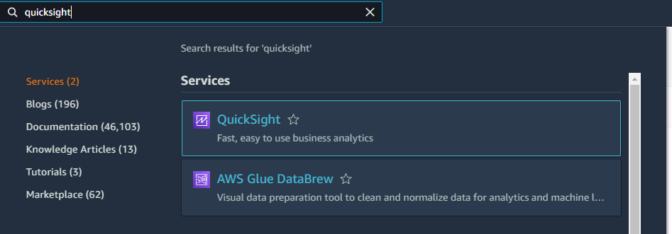
2. At the search bar, type in quicksight, and choose QuickSight from the list of related services, as shown below. A new window appears requesting you to sign up for QuickSight (step three).
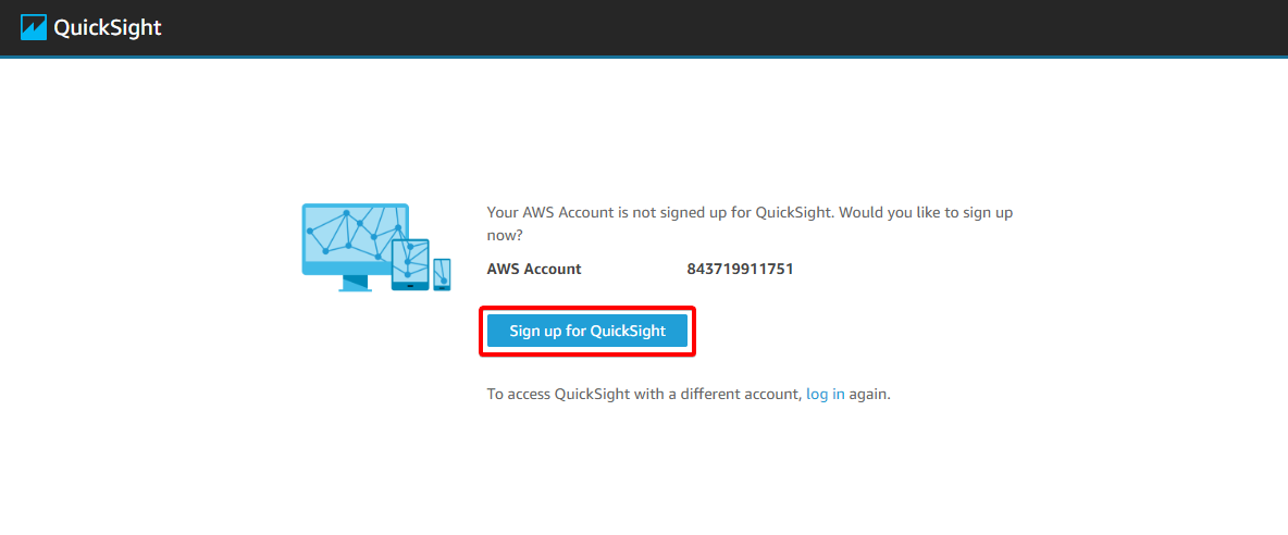
3. Click on the Sign up for QuickSight button, and the browser redirects to a page where you can set up your QuickSight account.
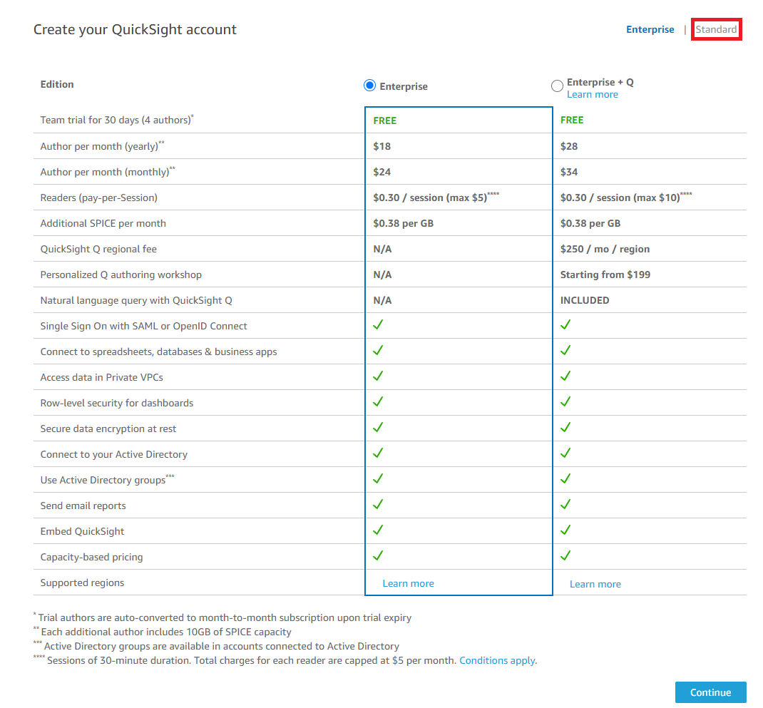
4. Now, click on the Standard option to access the page where you can set up a standard account.
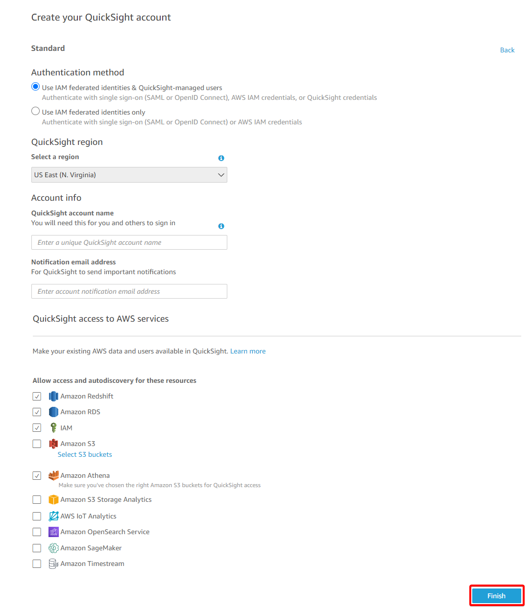
5. Fill out the given form, then click on Finish at the bottom of the page to complete the QuickSight sign-up process.
6. Finally, click on Go to Amazon QuickSight once you see the congratulation message below to access your QuickSight dashboard.
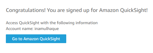
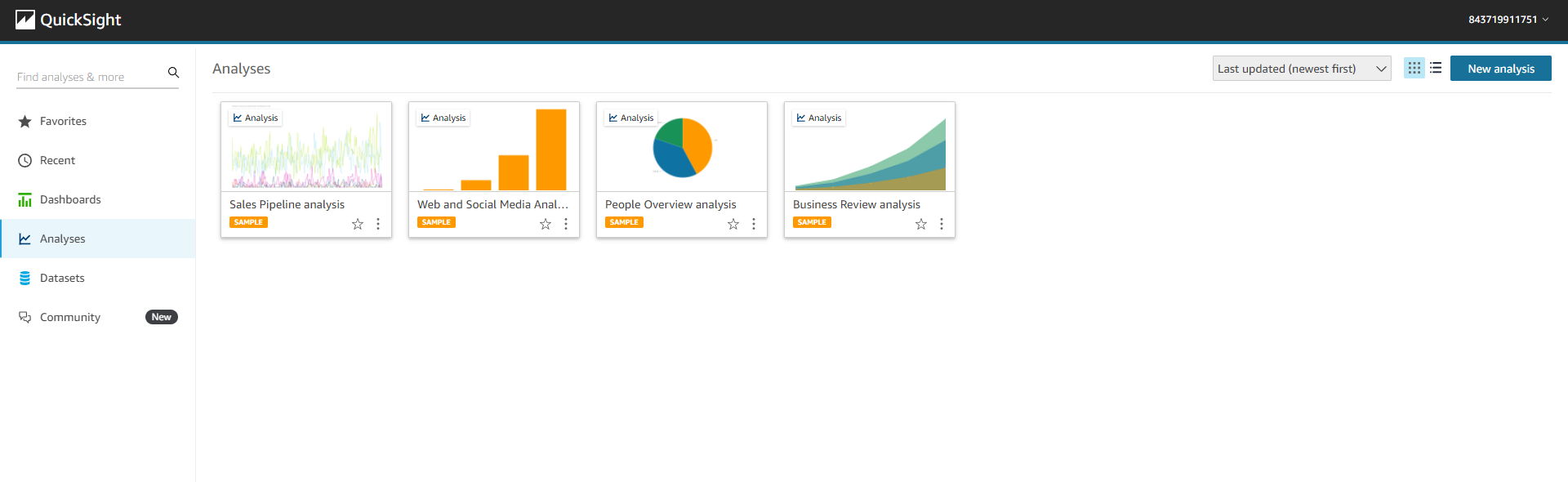
After successfully signing up for QuickSight, your browser redirects to the Analyses page, where you’ll find the available sample data.
Connecting and Loading Information Through Data Sources
Now that you’re on the Analyses page, you’ll see all available sample data, but ignore them as you’re about to upload your own and perform magic!
To upload and connect your data to QuickSight, do the following.
1. Click on the New Analysis button (top-right) to create a new Analysis. Doing so redirects your browser to the data sources page.

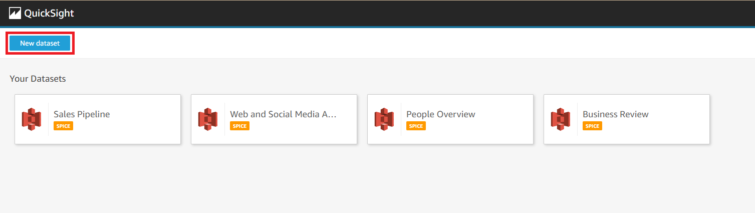
2. Next, click on the New Dataset button (top-left) to redirect to the page where you can upload your dataset.
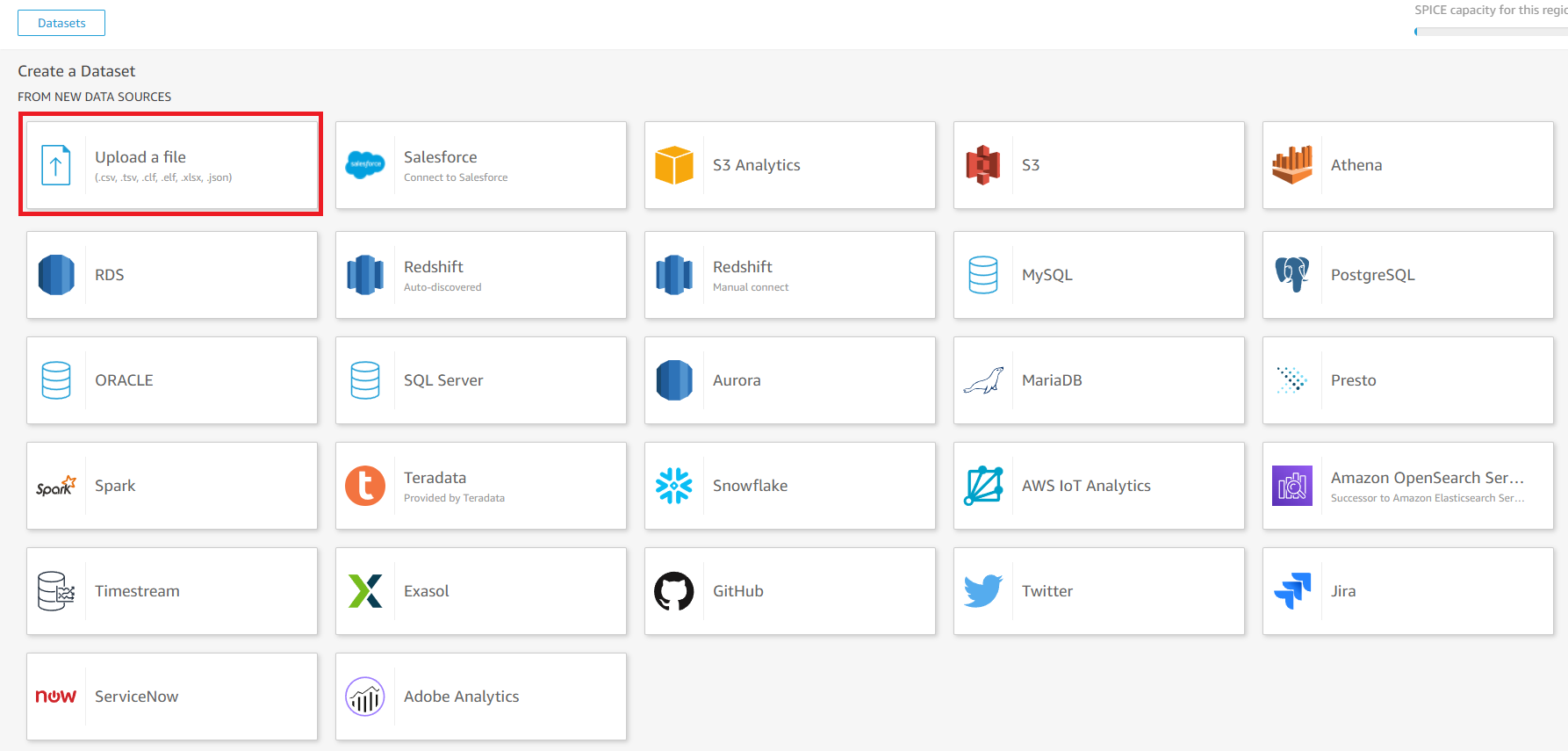
3. On the Create a Dataset page, click on the Upload a file option to locate and upload your dataset. You can select your own dataset file, but this tutorial uses a dataset in CSV format available at https://catalog.data.gov/dataset/md-covid-19-vaccinations-by-county.
The data used throughout this tutorial belongs to the state of Maryland, which is open to the public and available to use as information. The data contains the cumulative number of COVID-19 vaccinations within a single Maryland jurisdiction.
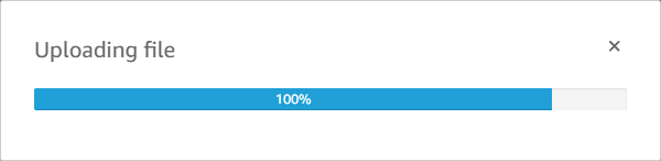
A new popup box appears to indicate the uploading progress. Uploading can take a while, depending on the size of the data and internet speed.
4. Now, click on the Next button in the confirmation popup box to confirm the dataset details.
If you need to transform your data to meet your requirements, don’t click on the Next button. Instead, skip to the following “Transforming Data Settings” section.
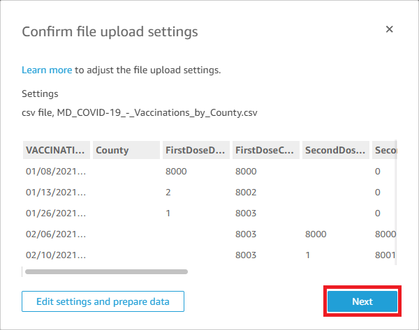
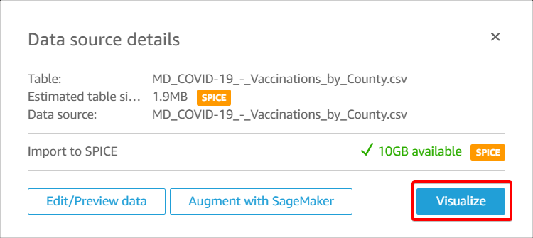
5. Lastly, click on Visualize to access your dataset’s dashboard.
Jump to the “Loading Data into Dashboard” section to see if you can load and visualize your dataset.
Transforming Data Settings
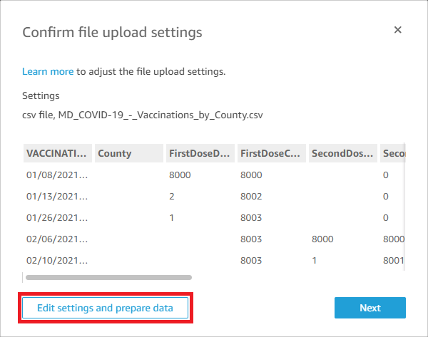
You’ve just uploaded your dataset file to QuickSight. But if for some reason, you need to edit the upload settings, QuickSight gives you that option. You transform your data by changing the field headers, deleting unnecessary fields, etc., before loading your dataset for visualization.
1. In the confirmation pop-up box, click on the Edit settings and prepare data button to proceed to the page where you can edit/delete unnecessary fields.
2. Next, click on the Country field header to edit the field name and description.
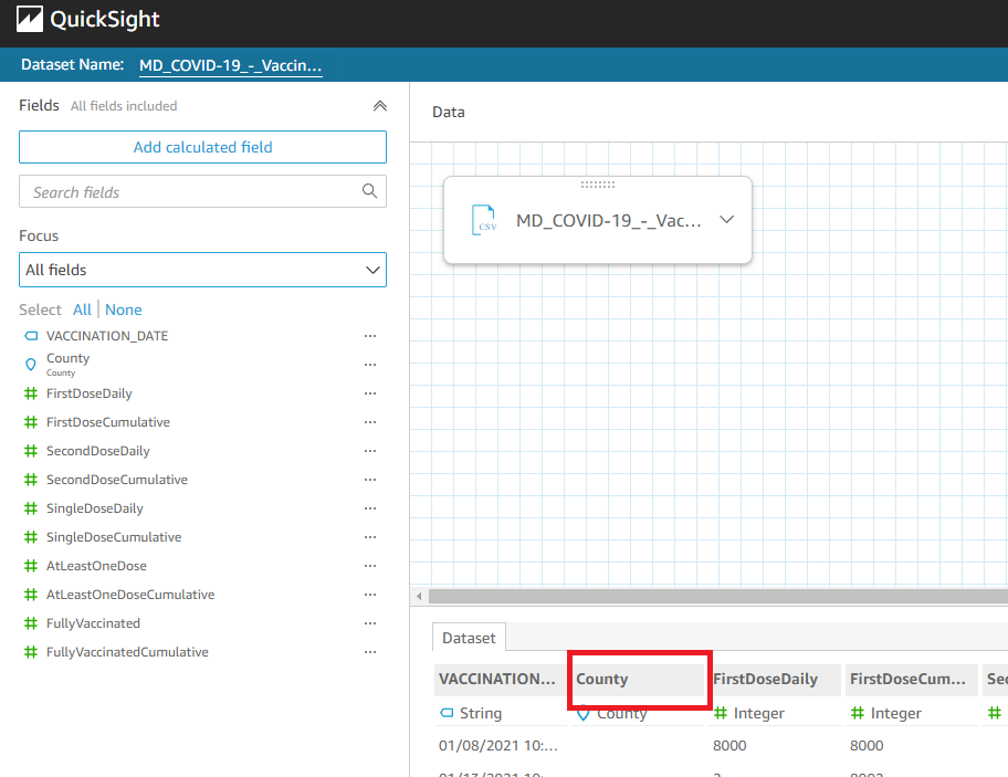
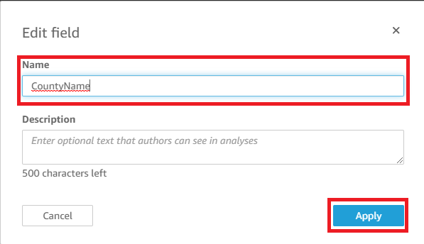
3. Change the field name to CountyName and click on Apply button to save the changes.
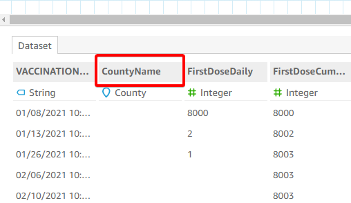
As you can see below, the Country header field changed to CountryName.
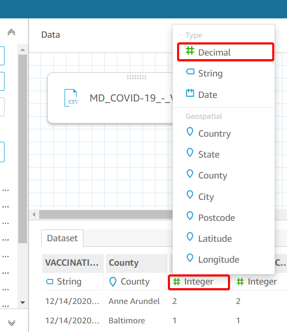
4. Click on the data type field on each column containing numbers and set the data type to Decimal, as shown below. Doing so avoids issues when you load your data to the dashboard.
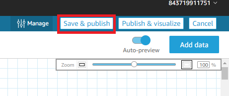
5. Finally, click on the Save & publish button (top right) of the screen to save the changes. After saving, your browser redirects to the dashboard screen to visualize your dataset.
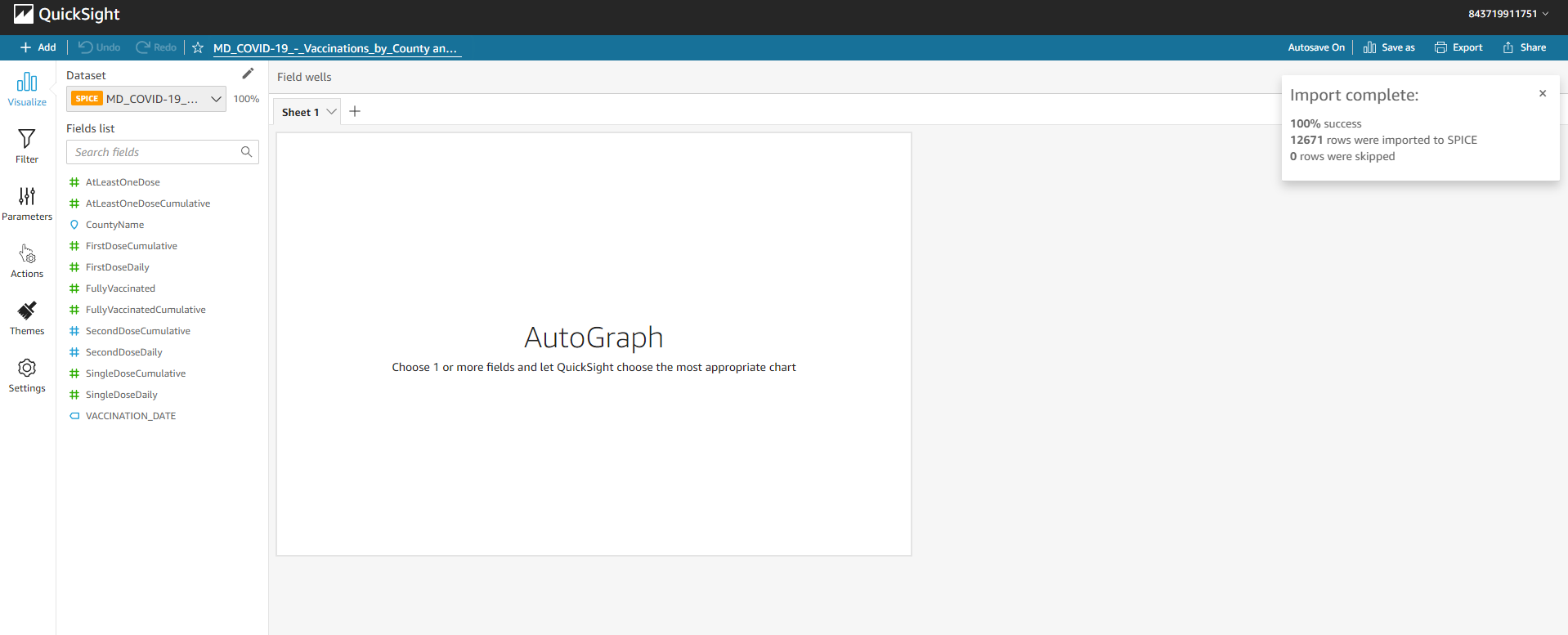
Below is what your dataset dashboard looks like.
Loading Data Into Dashboard
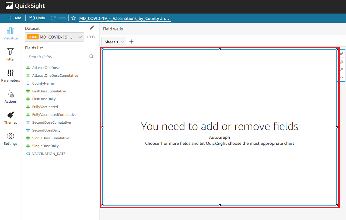
You now have access to your dataset dashboard, but the dashboard is empty right now. Not until you load your dataset to visualize on the dashboard with visuals.
AutoGraph is the default visual that lets you tell Amazon QuickSight to automatically choose the visual type for you when you select any field of data to visualize.
To load your data onto the dashboard:
1. Click on the visual if it’s not already selected.
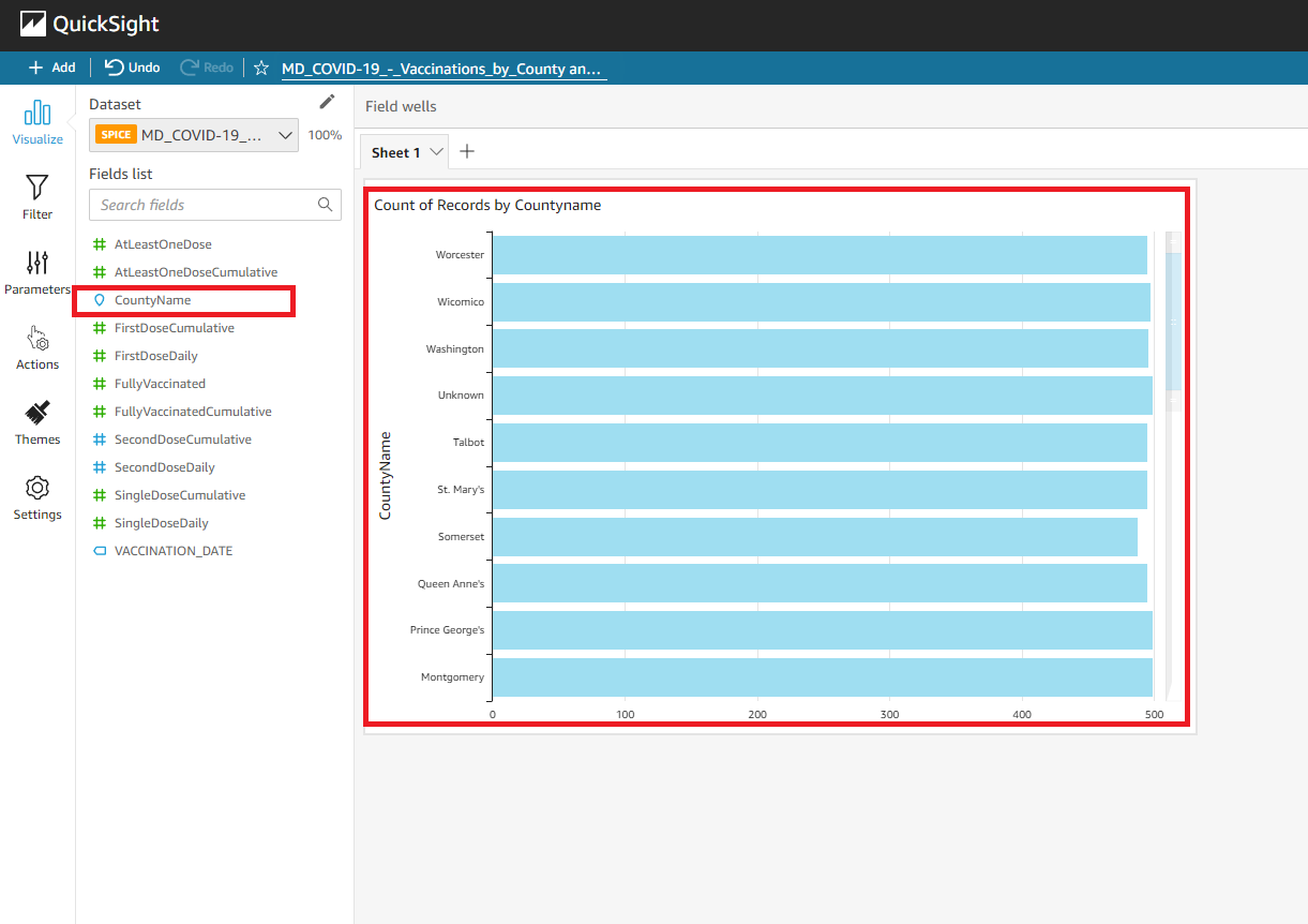
2. Next, click on any field name you like to add from the Fields list (left panel) to the visual. But the choice for this tutorial is the CountryName field.
Note that creating multiple AutoGraphs is possible. So, whenever you like to select a field and load its data, ensure the correct AutoGraph is selected.
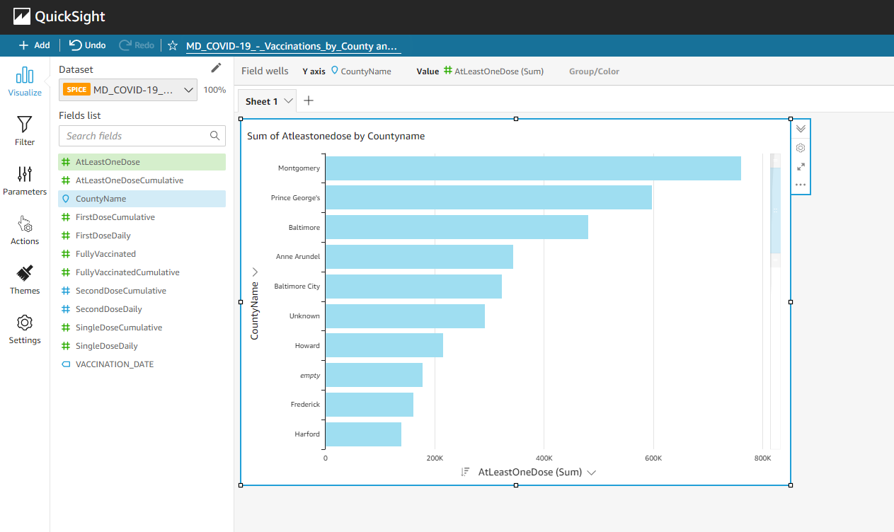
You can see below that the AutoGraph visual now shows data of the CountryName field.
3. Lastly, click on the AtLeastOneDose field from the field list to load its data to the AutoGraph. Doing so lets you filter the data to visualize on the AutoGraph.
As you can see below, the visualization changes as you load new data to the AutoGraph visual. The visualization now shows the sum of the AtLeastOneDose field by CountryName.
Notice that the loaded data is well-formatted because of AutoGraph’s selected visual type. But you can always choose a visual type that suits your needs by following the steps in the “Changing the Visual Type” section.
Configuring Dashboard Themes
You’ve seen how to load and visualize your data quickly. But admit it, you have your own preferred theme to visualize your data. The good thing is that QuickSight lets you configure your dashboard themes to fit your taste.
Click on the Themes option from the sidebar menu, and choose Starter themes from the drop-down menu, as shown below.
You’ll see the basic themes you can set for your visuals.
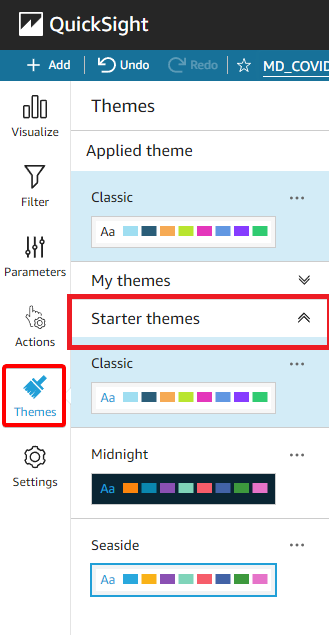
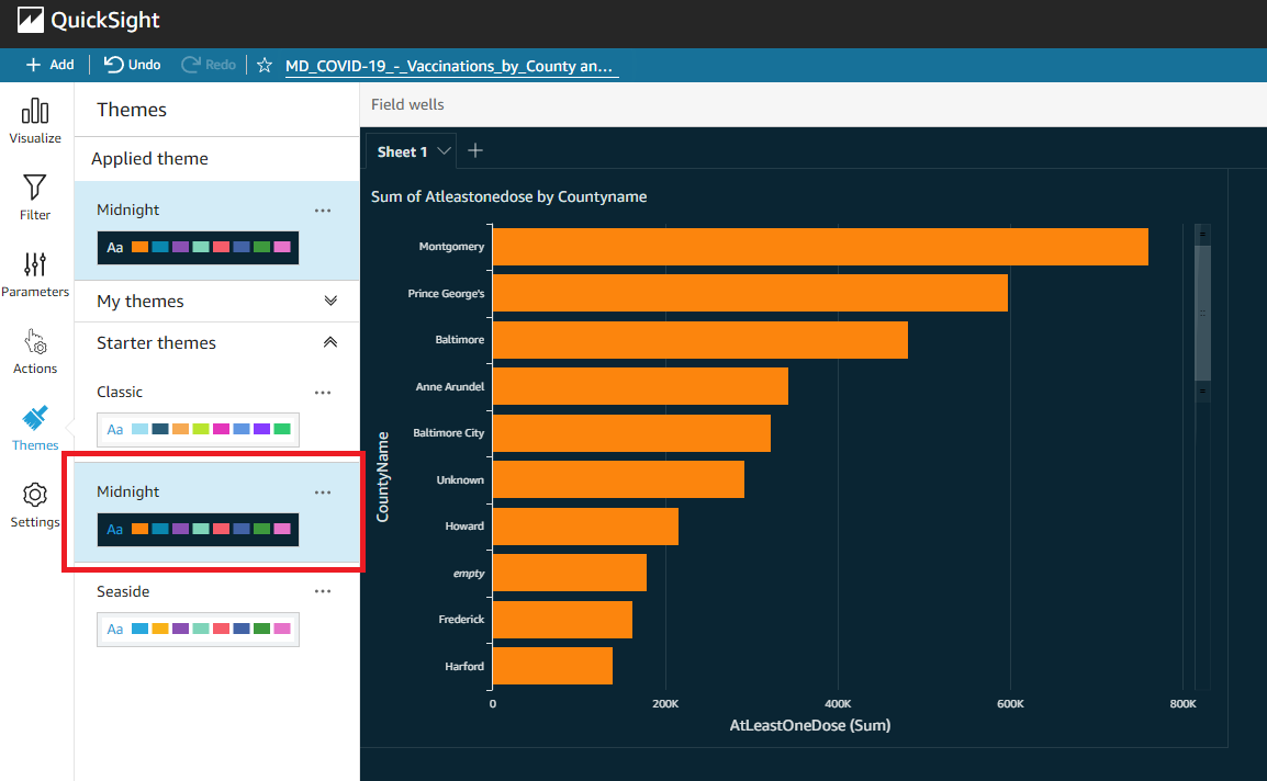
Now, select any available theme from the dropdown menu, but this tutorial uses the Midnight theme and applies it to the dashboard, as shown below.
Setting your preferred dashboard theme lets you analyze your data better.
Changing the Visual Type
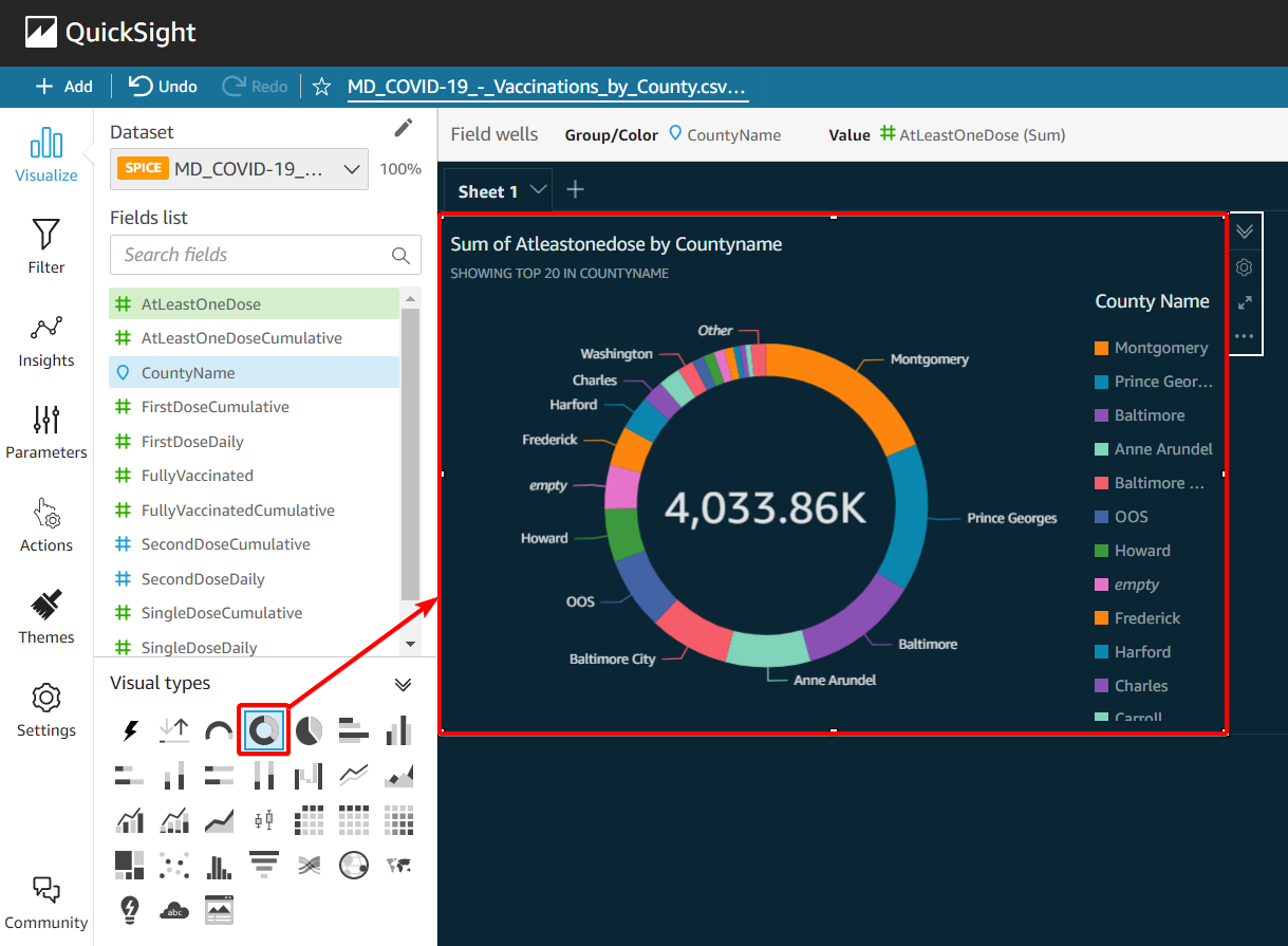
Besides changing the dashboard theme, don’t you think changing how you visualize your data would be great? How about a donut chart? QuickSight gives you the feature to create visualizations of your data in the format that suits your needs.
Navigate to the Visualize option at the left menu bar, and click on the visual to select it.
Now, click on the donut chart icon under the Visual types panel (bottom-left) to change how the visual displays your data, as shown below.
Creating a New Visual
Typically, data analysis doesn’t end with just one dashboard visualizing your data. QuickSight allows you to create multiple visuals in one dashboard. Each visual can have a different visual type and data loaded into your dashboard.
1. Click on the Add button (top left) and select Add visual to add a new visual to the dashboard.
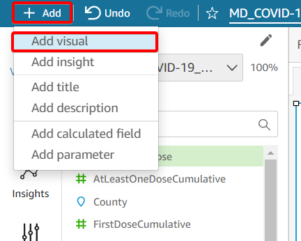
2. Next, click on the new visual to select it, and click on the AtLeastOneDose field to load data to the new visual.
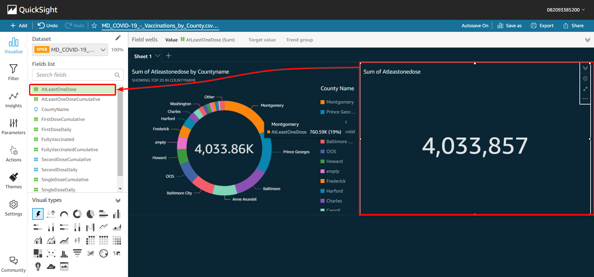
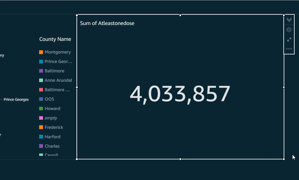
3. Lastly, drag the corner of the graph to minimize its size since the new visual contains the total numbers only.
Leveling Up the Visual with Custom Fields
Creating custom fields comes in handy to generate calculated data, and QuickSight gives you the ability to create your own calculated and conditional fields.
In this tutorial, you’ll create a custom field that calculates the sum of two available fields, FirstDoseDaily and SingleDoseDaily.
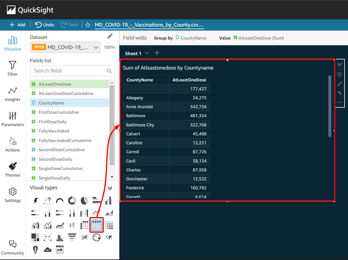
1. First, click on the table visual type icon and change the visual type from donut to table visual type.
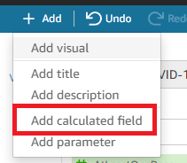
2. Next, click on Add button menu (top-left) and select Add calculated field option to create a custom-calculated field.
A new window appears where you can configure a new custom-calculated field.
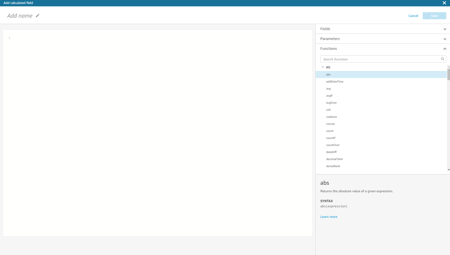
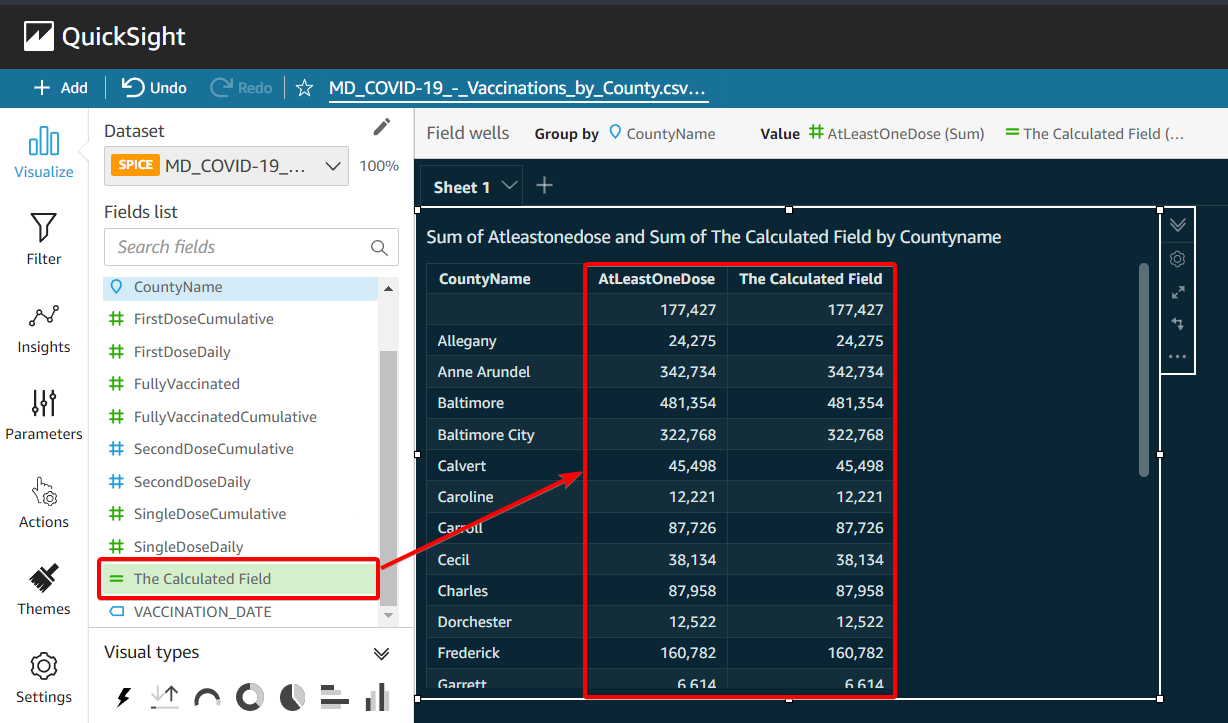
3. Add a name to this calculated field in the top text field. This tutorial sets the name to The Calculated Field.

4. Now, add the following formula to the scripting space. This formula sums up the value of the FirstDoseDaily field and the SingleDoseDaily field.
{FirstDoseDaily} + {SingleDoseDaily}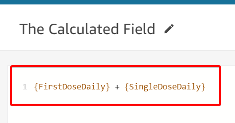
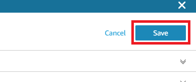
5. Click on the Save button (top-right) to save the calculated field you created.
6. Finally, click on the visual and select the new field (The Calculated Field) to add it to the visual.
Below, you can see the same results in The Calculated Field and AtleastOneDose fields because both have the sum of the FirstDoseDaily and SingleDoseDaily fields.
Publishing AWS QuickSight Dashboards
So far, you’ve managed to visualize data on your dashboard via the visuals. But perhaps you plan to share your dashboard with others to help with data analysis. If so, you’ll have to publish your dashboard first.
To publish any of your AWS QuickSight dashboards:
1. Click on the Share button (top-left), and select the Publish dashboard option.
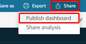
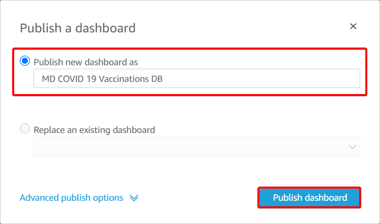
2. Next, name the dashboard as you like in the Publish new dashboard as text field shown below, and click on Publish dashboard to continue publishing. Doing so makes the dashboard accessible anytime.
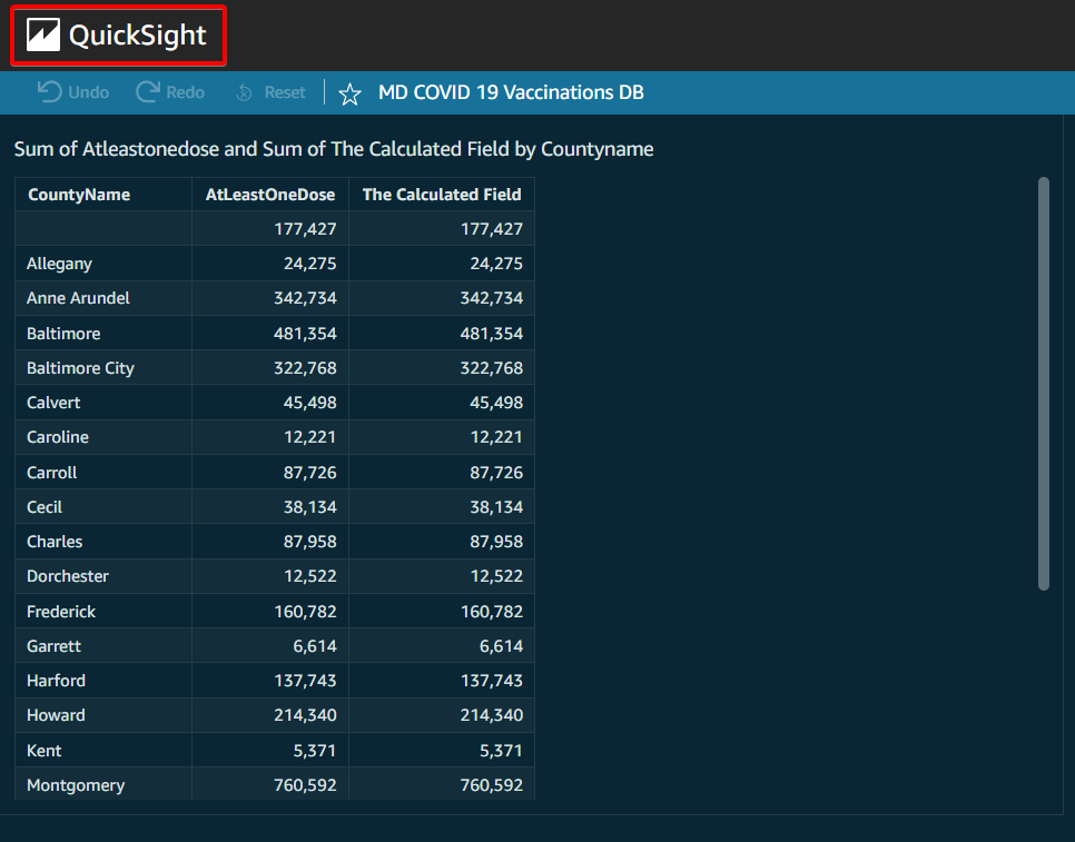
Before QuickSight publishes your dashboard, you’ll get a final look at it (step three).
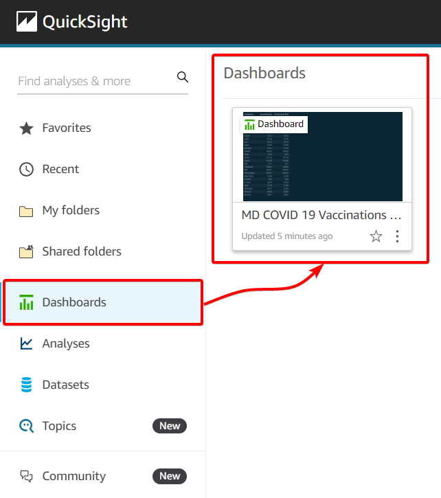
3. Click on the QuickSight logo (top-left) from the dashboard overview to navigate QuickSight’s home page.
4. Finally, select the Dashboards option from the sidebar menu to see all available dashboards in your QuickSight account.
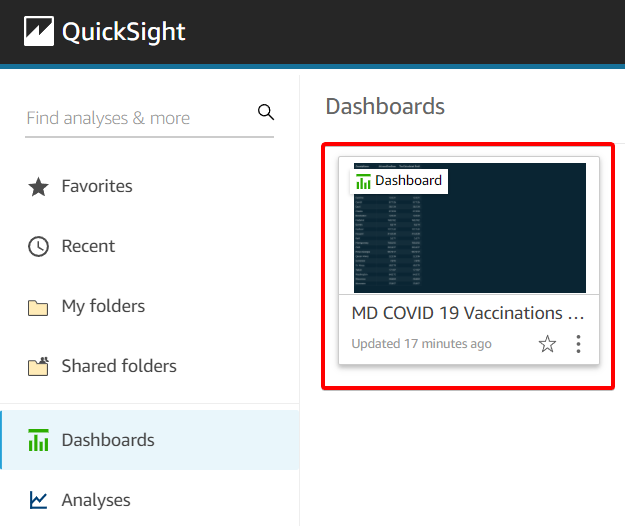
You’ll see the dashboard you published, accessible with a click.
Sharing Reports to Others
You’ve published your dashboard, so now you can share it with the other group members. Doing so allows them to use your analysis instead of creating their own. At the same time, they can help with your own data analysis.
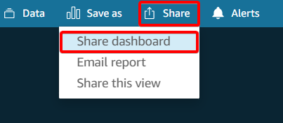
1. Click on the dashboard you want to share to open it.
2. Next, click on the Share button (top-right) on your dashboard, and select the Share dashboard option to initialize sharing your dashboard.
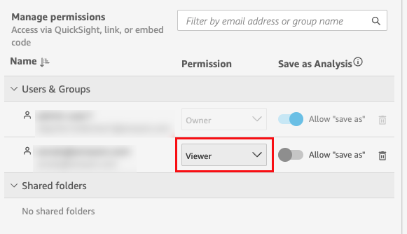
Below, you can see the Share dashboard window where you can control the sharing of your dashboard.
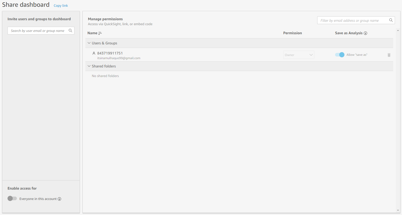
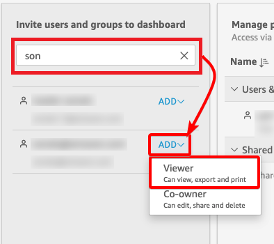
3. Lastly, type the user’s email address or the group name in the sidebar invitation panel. This action searches and lists the user you want to provide access to your dashboard.
Beside the listed user, click on ADD and select the permission (Viewer or Co-owner) to grant the user.
If nothing appears in the search result, you can invite users (even IAM users) to your QuickSight account.
If you need to change a user’s permission level, click on the Permission drop-down, and select the correct permission.
Conclusion
In this tutorial, you’ve learned how to master your data with AWS QuickSight. You’ve visualized your data in many ways with blazing-fast responses so that you can level up your data analysis. At this point, you not only have a way to create a dashboard for your data but also share it with others for collaboration.
With this newfound knowledge, why not build robust business strategies with more decisive acts and visual information to have clear business targets?