


Power BI is a formidable application due to its ability to visualize data and make complex relational table calculations. And if you need to handle aggregated data, the Power BI measure fields feature is all you need!
In this tutorial, you will learn how to add measure fields to your data to quickly aggregate and analyze data without going through complex tasks.
Stay tuned! Visualize, and dig through your data with Power BI measure fields!
Prerequisites
This tutorial will be a hands-on demonstration. If you’d like to follow along, be sure you have the following:
- Power BI subscription – The free trial will suffice.
- A Windows Server – This tutorial uses a Windows Server 2022.
- Power BI Desktop installed on your Windows Server – This tutorial uses Power BI Desktop v2.105.664.0.
- An on-premises data gateway installed on external devices planning to use a Desktop version.
- A sample data for Power BI – This tutorial uses Contoso Sales sample data.
Calculating Columns Using Data Analysis Expression (DAX)
When creating a data model, you can add to your tables by creating new columns using existing ones. A new column uses DAX to make row-by-row calculations of the columns involved. DAX is a formula expression language used in Analysis Services, Power BI, and Power Pivot in Excel.
DAX allows you to perform advanced calculations using its functions, operators, and value, which is crucial in analyzing data.
To calculate data between columns in Power BI:
1. Double-click on the Contoso Sales sample data you downloaded to open it on Power BI.
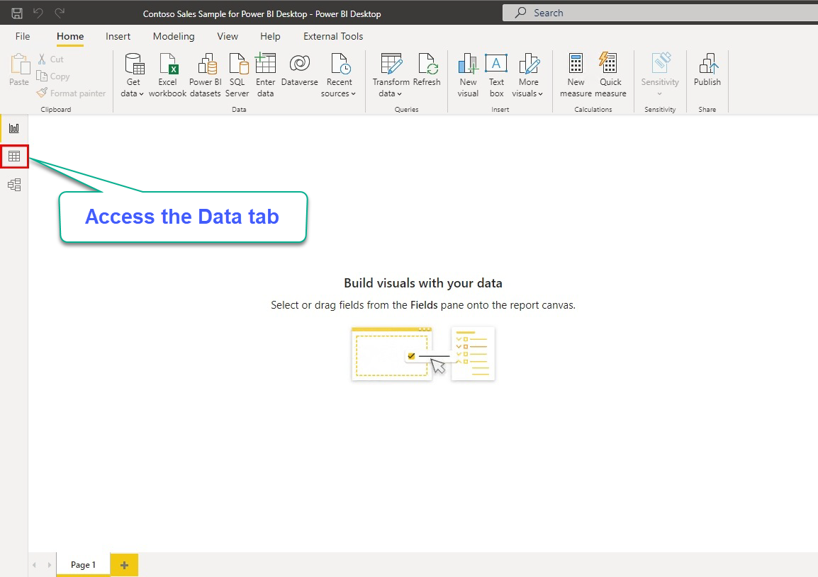
2. Click on the Data icon (left toolbar) to access the data tab, which loads the data from the imported tables, as you will see in the following step.
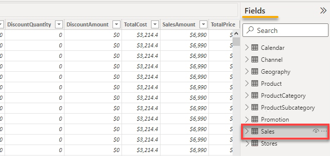
3. Next, select the Sales tables under the Fields pane (right-most) to load the table’s data.
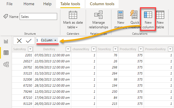
4. Now, click New column from the ribbon toolbar to create a new column. By default, a newly-created column is called Column, as shown below.
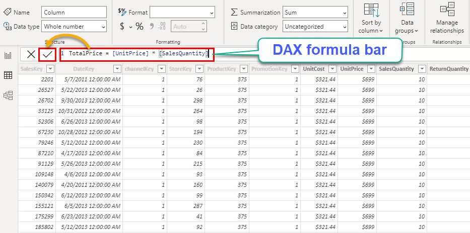
5. Replace the content of the DAX formula bar with the following formula.
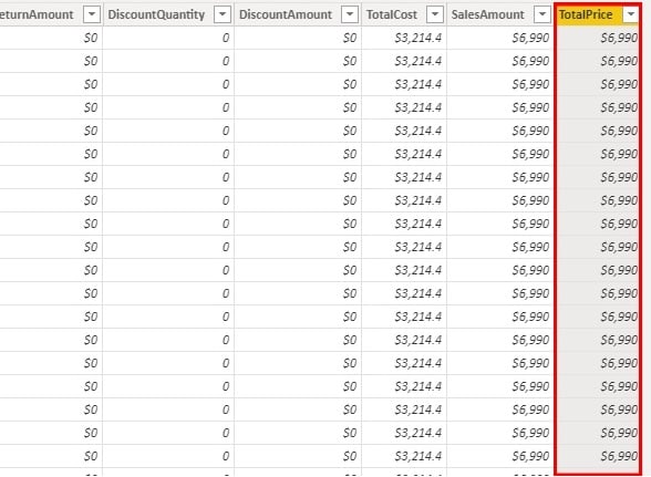
This formula replaces the new column’s name from Column to TotalPrice, which returns the products of each UnitPrice and SalesQuantity column.
TotalPrice = [UnitPrice] * [SalesQuantity]Click the check icon next to the DAX formula bar to apply the formula.
Like in the screenshot below, the new column (TotalPrice) appears as the last column.
6. Change the column’s format as you desire by selecting the column header and playing with different options under the Column tools ribbon tab.
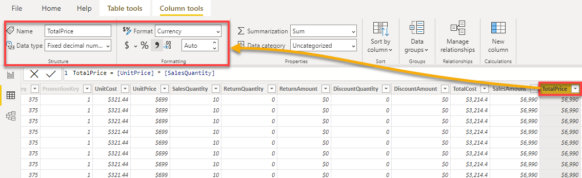
7. Finally, create another column, populate the following formula to the DAX formula bar, and apply the formula.
This formula calculates and returns the profit of every sale (Sales[TotalPrice] – Sales[TotalCost]).
Profit = Sales[TotalPrice] - Sales[TotalCost]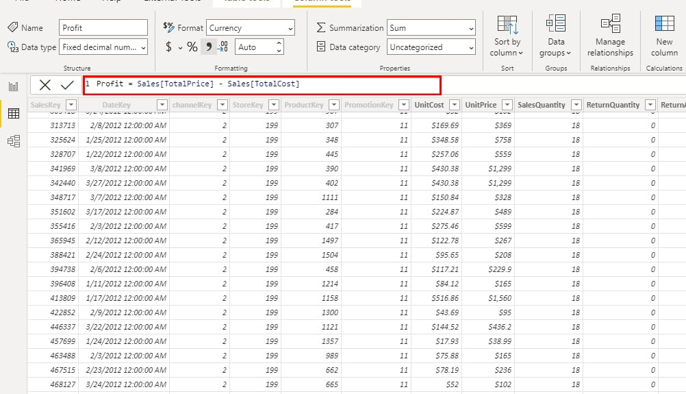
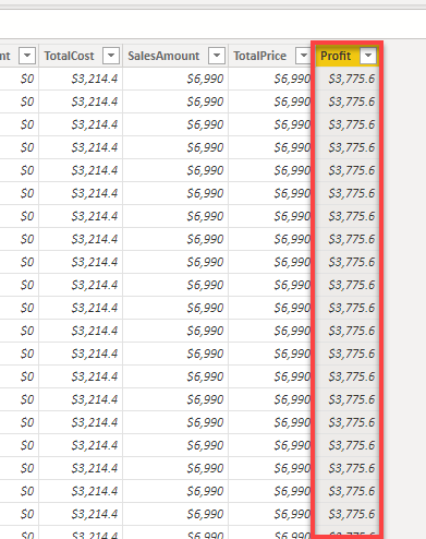
Below, you can see the calculated result of profits under the Profit column.
Calculating Data with Power BI Measure Fields
You’ve seen that columns can help find a row with the most profit or any row-level query. But to answer more complex questions. Like, which store gained the most profit? Or which salesperson made the most profit? You will need a measure, and creating Power BI measure fields will do the trick.
There are three types of measures in Power BI, which are automatic measures, quick measures, and manual measures. But for a start, you will dive into creating manual measures first.
Creating Manual Measures
Creating manual measures can help nurture your DAX skills if you know the basics. But if you’re unsure how DAX works, start using automatic and quick measures in the following sections. That way, you can learn the DAX language practically without writing any DAX formula.
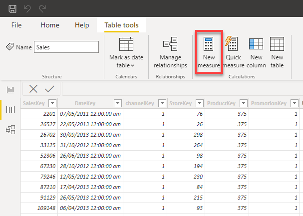
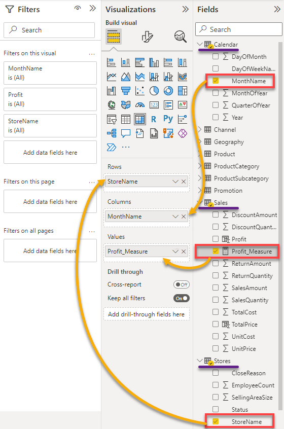
1. Click on New Measure and use DAX to create a new measure.
2. Next, apply the below formula to aggregate the profits data.
Profit_Measure = SUM(Sales[Profit])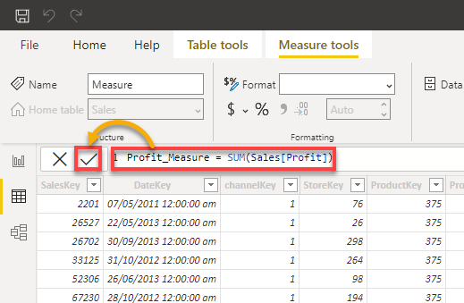
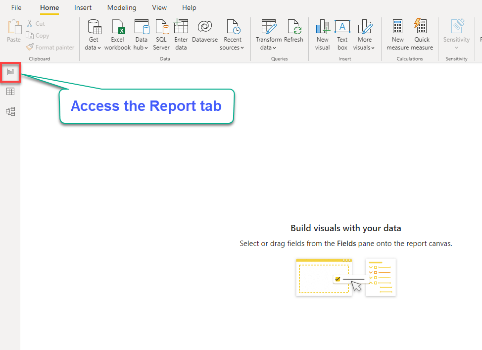
3. After adding your measure, click the Report icon (left toolbar) to access the Report tab, where you can build visuals with your data.
4. Now, click the Matrix visual type icon under the Visualizations pane to add a visual to the dashboard, as shown below.
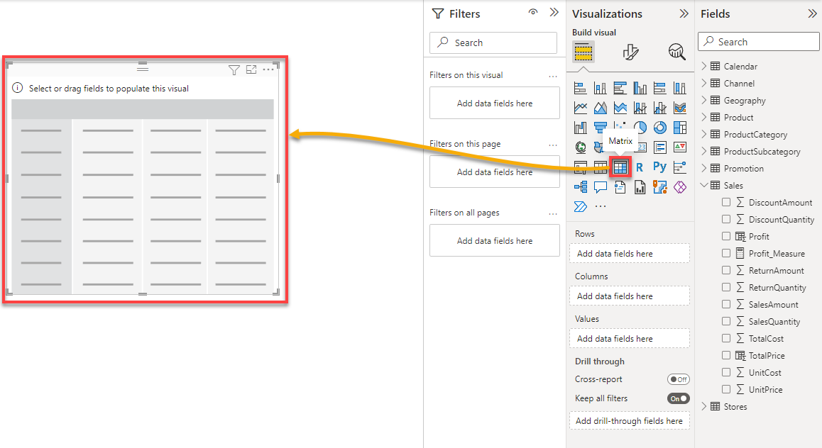
5. Add data to the Matrix visual with the following:
- Expand the fields (Tables) under the Fields pane.
- Drag and drop the columns from the Fields pane to the Rows, Columns, and Values dropdown inside the Visualizations pane.
After adding data to the Matrix, boom! You now see all the profits made by every store per month.
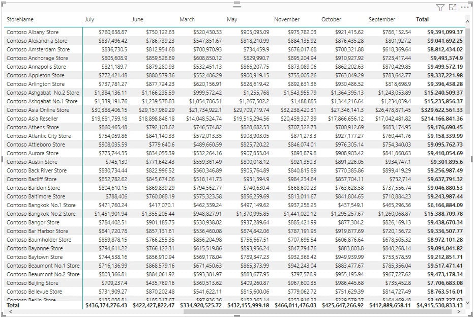
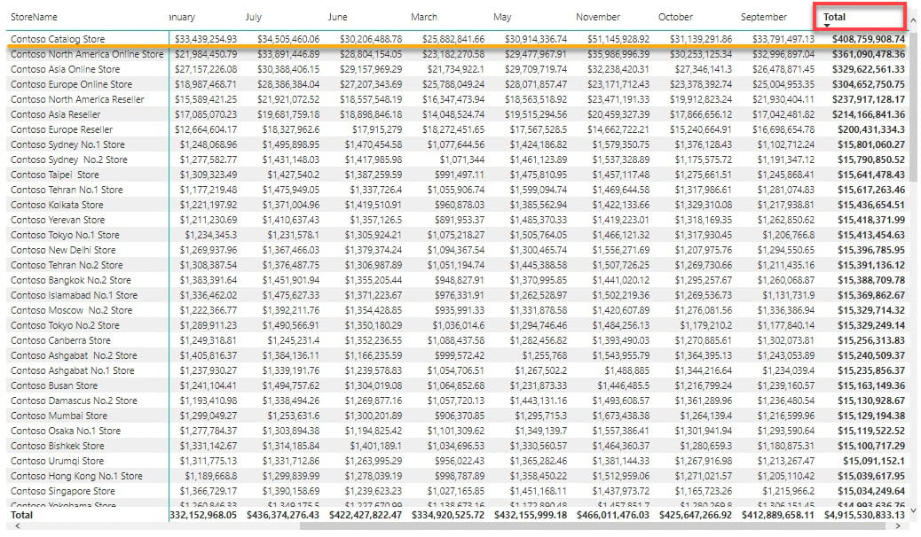
6. Finally, click on the Total column header to sort the data by the most profitable store in descending order.
Below, you can see that the Contoso Catalog Store is the most profitable.
Using Automatic Measures
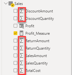
Power BI creates automatic measures when your column’s data type is a Number. The default automatic measure is SUM. As a result, when you add a numeric column to a visual, Power BI automatically adds a “total” column.
This behavior is helpful when you want to make straightforward measures, but it also affects columns you do not want to be measured or summarized.
You can identify if a table has a measure by checking if there is a sigma symbol next to it, as shown below.
To see how automatic measures work:
1. Add a column you do not want to be summarized to your visual, in this case, SalesAmount.
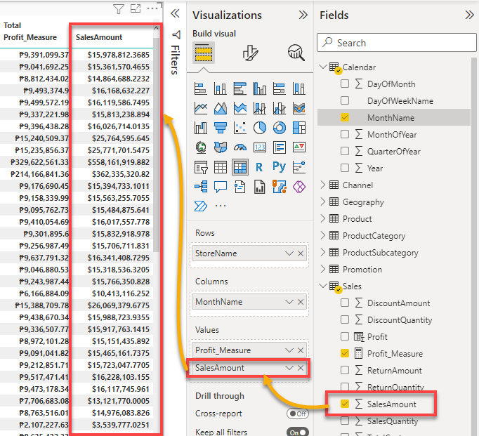
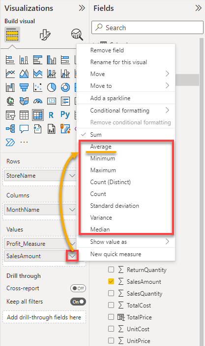
2. Next, click on the arrow-down icon next to the column you added, and choose a different measure for the column. But for this example, select Average.
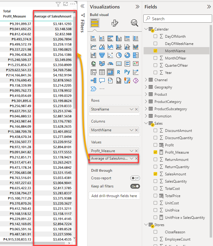
3. Lastly, look at the last column on your visual and see the change of measure.
Creating Quick Measures
A quick measure can be helpful when you are getting started with DAX. This measure lets you create calculations between your tables and show you the DAX expression on the calculation you picked afterward. All these without a need for DAX knowledge.
Perhaps you aim to get a total price in a column but are unsure how to write an equivalent DAX expression. If so, creating a quick measure will get the job done.
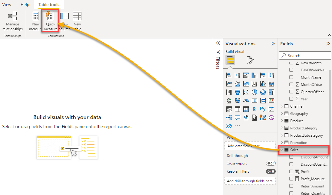
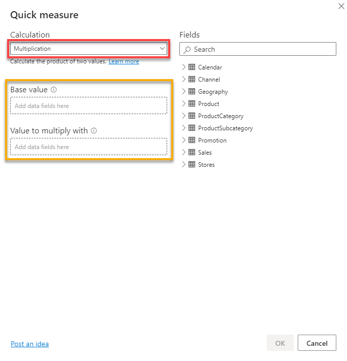
1. Click on the field/table to which you want to add the measure from the Fields pane and click Quick measure, as shown below. A pop-up window appears where you can choose which calculation to use for the quick measure (step two).
2. Next, select Multiplication in the Calculation dropdown field, which displays two fields for the values to multiply.
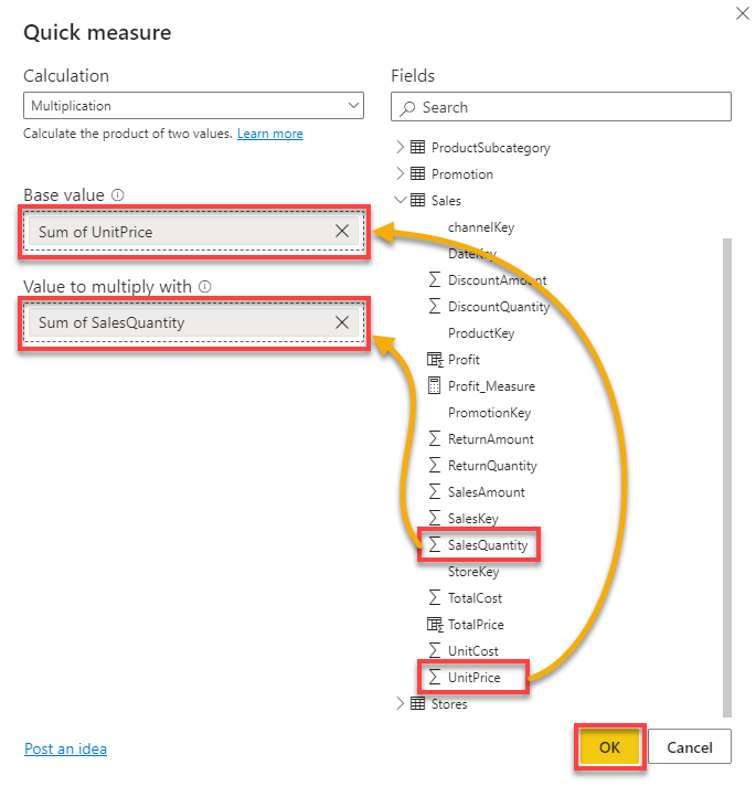
3. Finally, specify columns with values to multiple as follows:
- Expand a field/table under the fields section that holds the value you plan to multiply. In this case, the Sales table.
- Drag and drop the UnitPrice column to the Base value field, and add the SalesQuantity column to the Value to multiple with field.
- Click OK after specifying the columns to add the new measure.
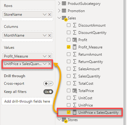
Now you have a new measure that you can add to your visual without having to write a DAX formula, as shown below.
Filtering Data by Slicing Visuals
Previously, you have answered which store is most profitable. As much as the answer was informative, it is not satisfying, or you are getting too much information.
What if you aim to analyze who made the most profits in the previous year? This part is where slicers become critical to your dashboard. Slicers help dice your data into smaller pieces, helping you gain more detail and information.
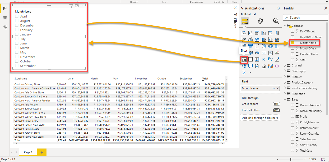
1. Add a slicer visual for the MonthName column with the following:
- Click outside the currently selected slicer to de-select it.
- Select the Slicer visual type icon under the Visualizations pane to add a slicer to your dashboard.
- Tick the box in the MonthName column under the Calendar table to add it to the slicer.
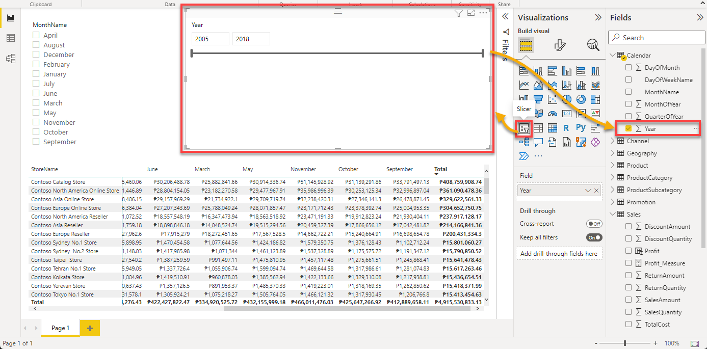
2. Next, add another slicer for the Year column:
- De-select the currently selected slicer, and click on the Slicer visual type icon again to add a new visual.
- Tick the box in the Year column to add the column to the slicer.
Thanks to the slicer, you already have more information, where the data runs from 2005 to 2018, as shown below.
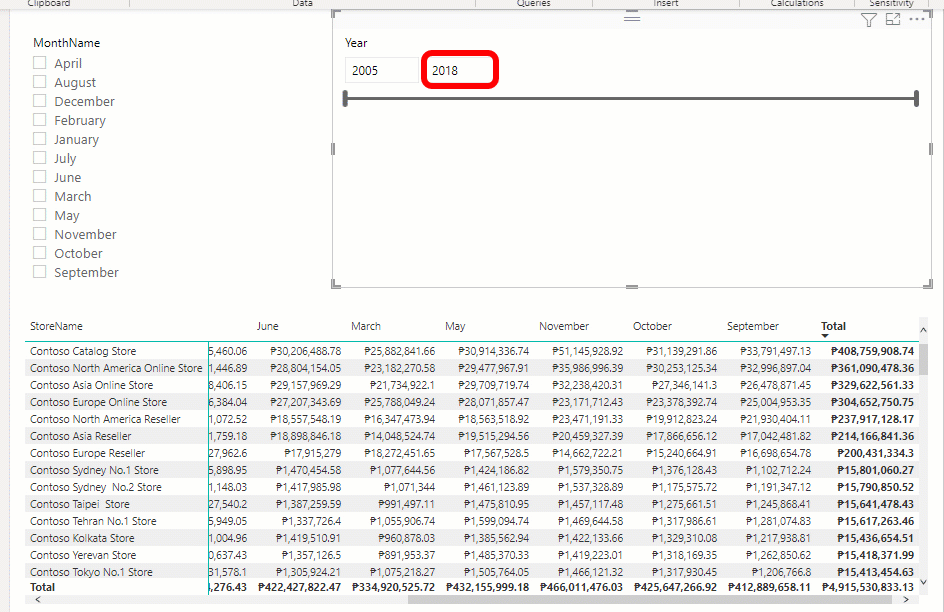
3. Drag the slider to scroll through the years. As soon as you release the slider, you will see the sales start from 2011 to 2018.
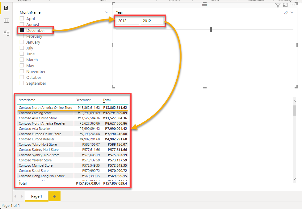
4. Now, filter the data on the Matrix visual with the following:
- Now, tick the box on December in the MonthName slicer.
- Put the year 2012 on the fields in the Year slicer.
After these changes, you can check which store made the most profit in December 2012, as shown below: Contoso North America Online Store.
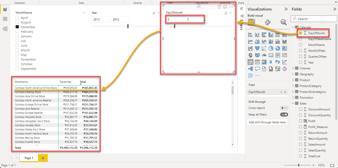
5. Ultimately, add another slicer for the DayOfMonth column, and set field values to 5.
Check your Matrix slicer, and you will see which store made the most profit on December 5, 2012, which is still the Contoso North America Online Store.
Conclusion
Measures give you an edge when viewing data, especially those which include numbers. And in this tutorial, you have learned how Power BI lets you aggregate those numbers. At this point, you should be confident enough to answer quantity-driven questions by analyzing your data with Power BI measure fields.
As great as measures can be, you get more specific details from your data, as you did by adding slicer visuals. This information can influence business decisions in a good way and is quick to implement.
With this newfound knowledge, would you like to dive deep into DAX to create manual measures for a more personalized data visualization? Or would you opt for either quick or automatic measures?