

Creating statistical plots in Python can be a pain, especially if you’re generating them manually. But with the help of the Seaborn Python data visualization library, you can simplify your work and create beautiful plots quickly and with fewer lines of code.
With Seaborn, creating beautiful statistical plots for your data is a piece of cake. This guide will show you how to use this powerful library through real-life examples.
Prerequisites
This tutorial will be a hands-on demonstration. If you’d like to follow along, be sure you have the following:
- A Windows or Linux computer with Python and Anaconda installed. This tutorial will be using Anaconda 2021.11 with Python 3.9 on a Windows 10 PC.
What is the Seaborn Python Library?
The Seaborn Python library is a Python data visualization library built upon the Matplotlib library. Seaborn offers a rich set of high-level tools for creating statistical charts and plots. Seaborn’s capacity to integrate with Pandas Dataframe objects allows you to visualize data quickly.
A DataFrame represents tabular data, like what you would find in a table, spreadsheet, or a comma-separated values CSV file.
Seaborn works with Pandas DataFrames and converts data under the hood into code that Matplotlib can understand.
While there are many high-quality plots available, you’ll learn in this tutorial about the three most common built-in Seaborn plot families to help you get started.
- Relational plots.
- Distribution plots.
- Categorical Plots.
Seaborn includes many more plots, and this tutorial cannot cover all. The Seaborn API documentation and the tutorial are excellent starting points for getting to know all of the different kinds of Seaborn plots.
Setting Up a New JupyterLab and Seaborn Python Environment
Before starting your Seaborn journey, you’ll first need to set up a Jupyter Lab environment. Also, for consistency with the examples, you’ll be working on a specific dataset along with this tutorial.
JupyterLab is a web application that allows you to combine code, rich text, plots, and other media into a single document. You can also share notebooks online with others or use them as executable documents.
To begin setting up your environment, follow these steps.
1. Open the Anaconda Navigator on your computer.
a. On a Windows computer: Click Start —> Anaconda3 —> Anaconda Navigator.
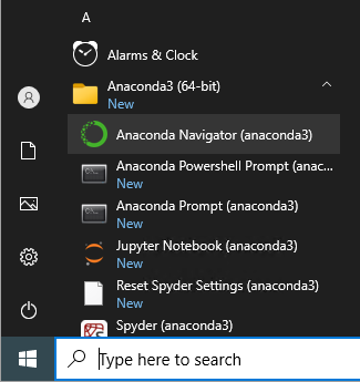
b. On a Linux computer: Run the anaconda-navigator command on the terminal.
2. On the Anaconda Navigator, look for the JupyterLab application and click Launch. Doing so will open an instance of JupyterLab in a web browser.
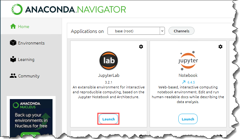
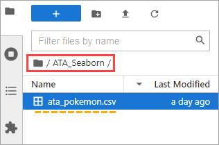
3. After launching JypyterLab, open the File Browser sidebar and create a new folder called ATA_Seaborn under your profile or home directory. This new folder will be your project directory.
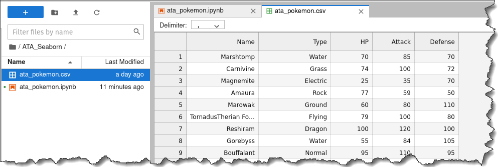
4. Next, open a new browser tab and download the Pokemon dataset. Make sure to save the ata_pokemon.csv file to the project directory you created, which, in this example, is ATA_Seaborn.
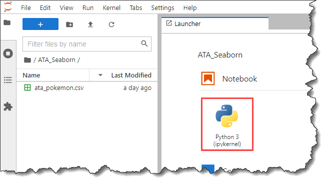
5. Back on the JupyterLab, double click the ATA_Seaborn folder. You should now see the ata_pokemon.csv under that folder.
6. Now, click on the Python 3 button under the Notebook section on the Launcher tab to create a new notebook.
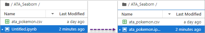
7. Now, click the new notebook Untitled.ipynb and press F2 to rename the file. Change the filename to ata_pokemon.ipynb.
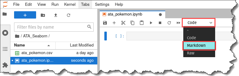
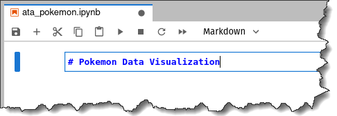
8. Next, add a title to your notebook. This step is optional but recommended to make your project more identifiable.
On your notebooks’ toolbar, click the dropdown menu that says Code and click Markdown.
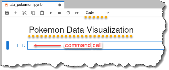
9. Enter the text, “# Pokemon Data Visualization”, inside the markdown cell and press the Shift + Enter keys.
The cell type selection automatically changes to Code, and the notebook will have the title Pokemon Data Visualization at the top.
10. Finally, save your work by pressing the Ctrl + S keys.
Make sure you save your work frequently. You should save your work often to avoid losing anything if there is any problem with the internet connection. Whenever you make a change, hit
CTRL+Sto save your progress. You can also click the Save button on the toolbar.
Importing the Pandas and Seaborn Python Libraries
Python code typically begins with importing the necessary libraries. And in this project, you’ll be working with the Pandas and Seaborn Python libraries.
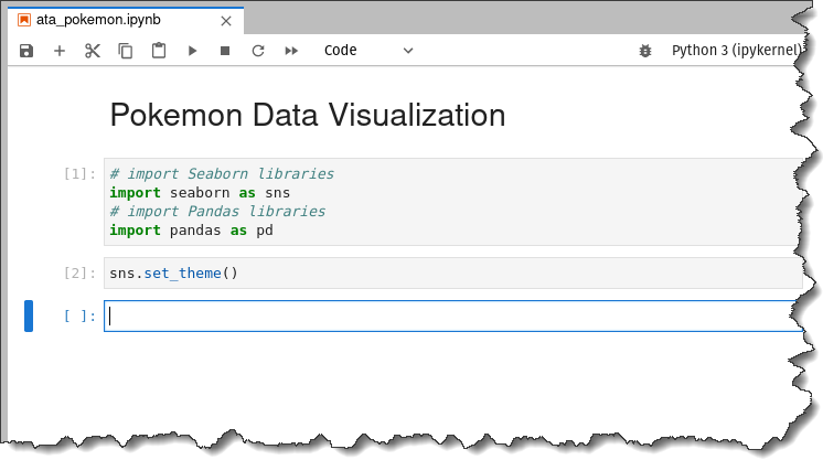
To import Pandas and Seaborn, copy the code below and paste it into the command cell on your notebook.
Remember this — to run the code or commands in the command cell, press the Shift + Enter keys.
# import Seaborn libraries
import seaborn as sns
# import Pandas libraries
import pandas as pd
Next, run the command below to apply the Seaborn default theme aesthetics to the plots you’ll be generating.
sns.set_theme()Seaborn has five built-in themes available. They are darkgrid (default), whitegrid, dark, white, and ticks.
Importing the Sample Dataset
Now that you’ve set up your JupyterLab environment let’s import the data from the dataset to your Jupyter environment.
1. Run the pd.read_csv() command in the cell to import the data. The dataset filename must be inside the parenthesis to indicate the file to import enclosed in double-quotes.
The command below will import the ata_pokemon.csv and store the dataset to the pokemon variable.
pokemon = pd.read_csv("ata_pokemon.csv")2. Run the pokemon.head() command to preview the first five rows of the imported dataset.
pokemon.head()You will get the following output.
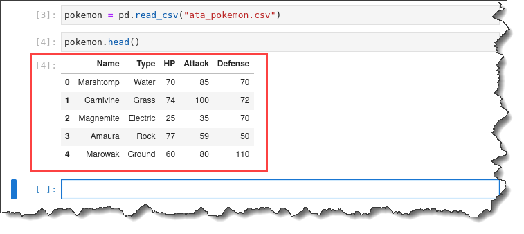
3. Double-click on the ata_pokemon.csv file on the left to inspect every individual row. You will get the following output.
As you can see, this dataset is quite convenient to work with because it lists each observation by row, and all the numerical information is in separate columns.
Now, let’s ask some questions about the dataset to help with the analysis.
- What is the relationship between Attack and HP?
- What is the distribution of Attack?
- What is the relationship between Attack and Type?
- What is the distribution of Attack for each Type?
- What is the average, or mean, Attack for each Type?
- And what is the count of Pokemon for each Type?
Notice that many of these questions focus on numerical and categorical data relationships. Categorical data means non-numerical data, which, in this sample dataset, is the Type of Pokemon.
Unlike Matplotlib, which is optimized for creating plots with strictly numerical data, you can use Seaborn to analyze data that has both categorical and numerical data.
Creating Relationship Plots
So you’ve imported a dataset. What’s next? Now you’ll use your imported data and generate statistical plots out of them. Let’s start with creating relational or relationship plotting to discover the relationship between HP and Attack data.
Relationship plotting is practical when identifying possible relationships between variables in your dataset. Seaborn has two plots for charting out relationships: scatter plots and line plots.
Line plotting
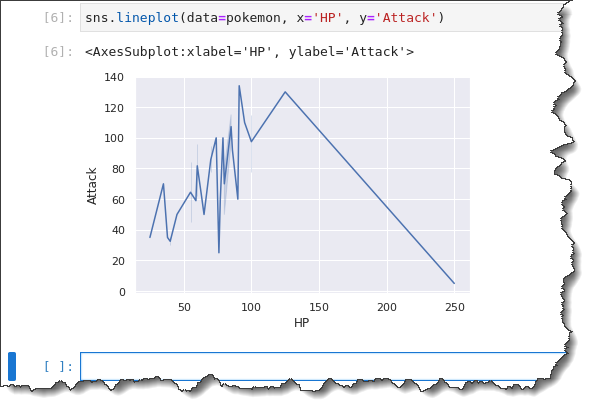
Creating a line plot requires you to call the Seaborn Python lineplot() function. This function takes three parameters — data=<data source>, x='<x-axis value>', and y='<y-axis value>‘.
Copy the command below and run it in your Jupyter command cell. This command uses the pokemon object as the data source you previously imported, the HP column data for the x-axis, and the Attack data for the y-axis.
sns.lineplot(data=pokemon, x='HP', y='Attack')As you can see below, the line plot doesn’t do a great job of showing you the information you can quickly analyze. A line plot is better at showing an x-axis that follows a continuous variable like time.
In this example, you are plotting out a discrete variable HP. So what happens is that the line plot goes all over the place. And it’s harder to infer a trend.
Scatter Plotting
A part of exploratory data analysis is trying out different things to see what works well. And in doing so, you’ll learn that some plots can show you better insights than others.
What makes a better relationship plot than line plots, then? — Scatter plots.
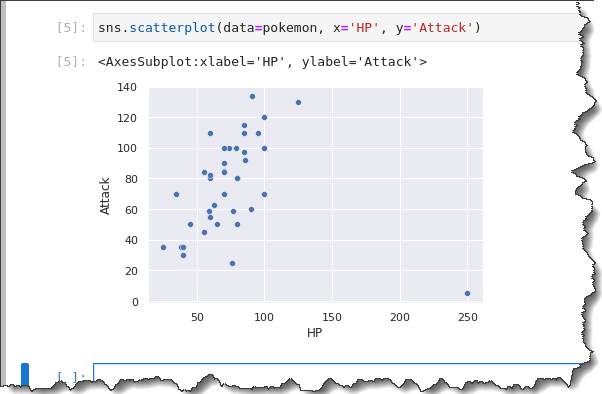
To make a scatter plot, you call the scatterplot function, sns.scatterplot, and pass in three parameters: data=pokemon, x=HP, and y=Attack.
Run the following command to make a scatterplot for the pokemon dataset.
sns.scatterplot(data=pokemon, x='HP', y='Attack')As you can see on the below result, the scatter plot shows you that there may be a general positive correlation between HP (x-axis) and Attack (y-axis), with one outlier.
Generally, as HP increases, the Attack does too. Pokemon with larger health points tend to be stronger.
Scatter Plotting with Legends
While the scatter plot already presented a more sensible data visualization, you can still further improve the graph by breaking down the type distribution with a legend.
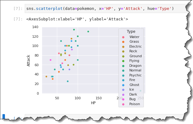
Run the sns.scatterplot() function again in the following example. But this time, append the hue='Type' keyword, which will create a legend showing the different Pokemon Types. Back on your Jupyter notebook tab, run the command below.
sns.scatterplot(data=pokemon, x='HP', y='Attack', hue='Type')Notice on the result below, the scatter plot now has different colors. Analyzing the categorical aspects of your data is now much better due to the visual distinctions that the legend provides.
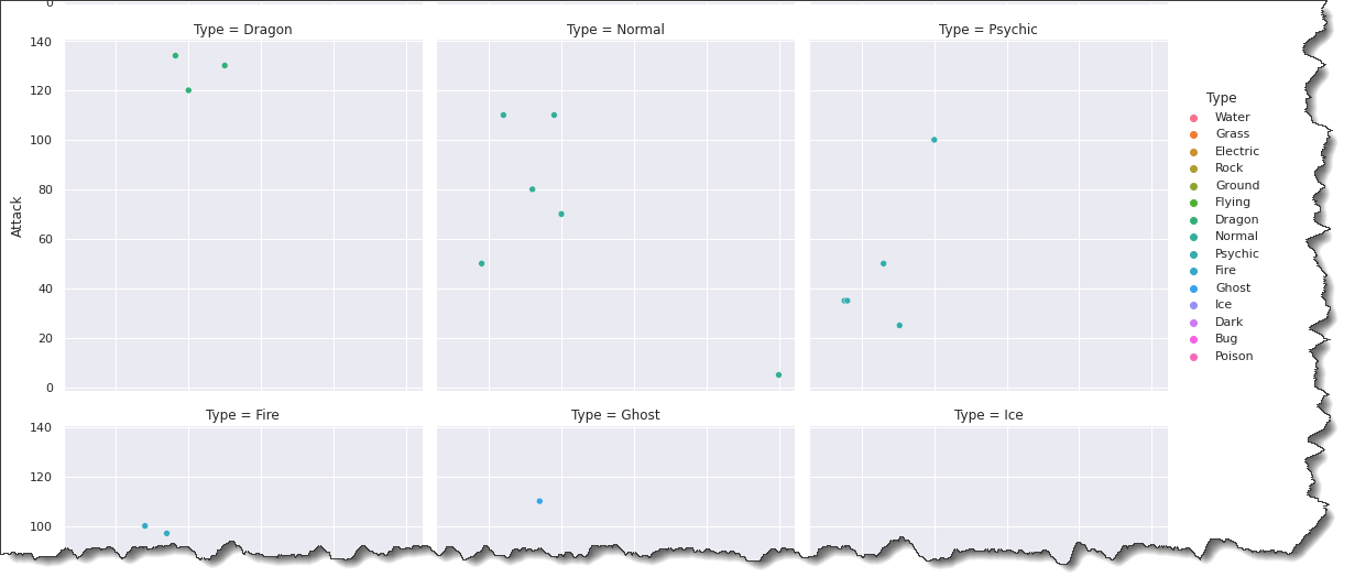
What’s even better is you can still break down the plot even further by using the sns.relplot() function with the col=Type and col_wrap keyword arguments.
Run the command below in Jupyter to create a plot for each Pokemon Type in a multi-plot grids format.
sns.relplot(data=pokemon, x='HP', y='Attack', hue='Type', col='Type', col_wrap=3)Looking at the result below, you can infer that HP and Attack are generally somewhat positively correlated. Pokemon with more HP tend to be stronger.
Would you agree that adding colors and legends makes plotting more interesting?
Creating Distribution Plots
In the previous section, you have created a scatterplot. This time, let’s use a distribution plot to get insights about the distribution of Attack and HP for each Pokemon Type.
Histogram Plotting
You can use the histogram to visualize the distribution of a variable. In your sample dataset, the variable is the Pokemon’s Attack.
To create a histogram plot, run the sns.histplot() function below. This function takes two parameters: data=pokemon and x='Attack'. Copy the command below and run it in Jupyter.
sns.histplot(data=pokemon, x='Attack')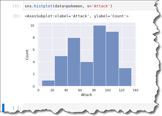
When creating a histogram, Seaborn automatically picks an optimal bin size for you. You might want to change the bin size to observe the data distribution in differently shaped groupings.
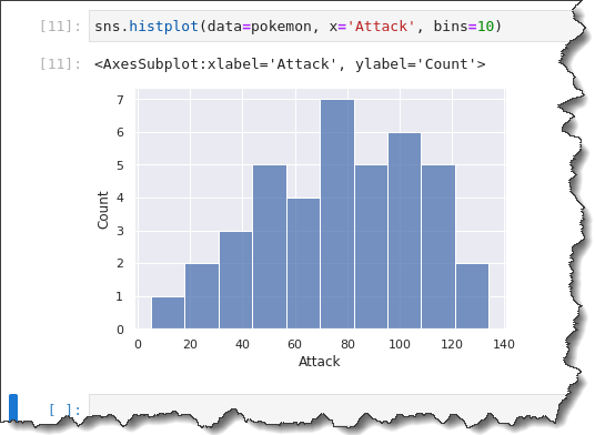
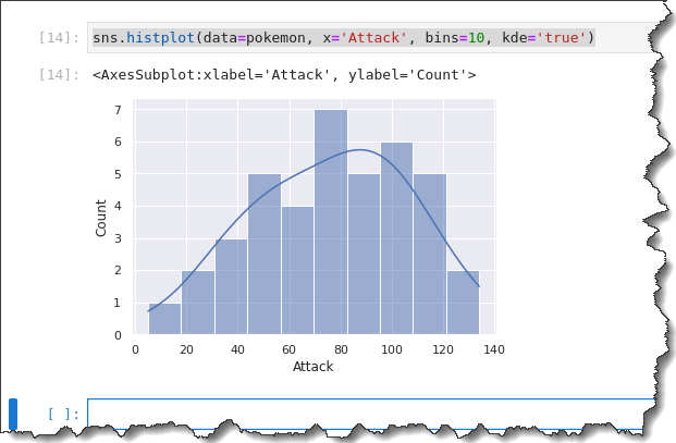
To specify a fixed or custom bin size, append the bins=x argument to the command where x is the custom bin size. Run the command below to create a histogram with a bin size of 10.
sns.histplot(data=pokemon, x='Attack', bins=10)In the previous histogram you generated, the Pokemon Attack appears to have a bimodal distribution (two big humps.)
But when you look at your bin size of 10, the groupings are broken down more segmentally. You can see that there’s more of a unimodal distribution, with a rightward skew.
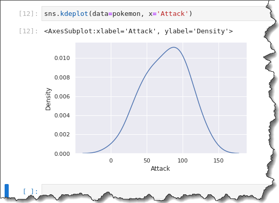
Kernel Density Estimation (KDE) Plotting
Another way to visualize distribution is with kernel density estimation plotting. KDE is essentially like a histogram but with curves instead of columns.
The advantage of using a KDE plot is that you can make quicker inferences about how the data is distributed because of the probability curve, showing features such as central tendency, modality, and skew.
To create a KDE plot, call the sns.kdeplot() function and pass in the same data=pokemon, x='Attack' as arguments. Run the code below in Jupyter to see the KDE plot in action.
sns.kdeplot(data=pokemon, x='Attack')As you can see below, the KDE plot is similar in skewing to the histogram with a bin size of 10.
Since the histogram and KDE are similar, why not use them together? Seaborn lets you overlay the KDE on a histogram by adding the keyword kde='true' argument to the previous command, as you can see below.
sns.histplot(data=pokemon, x='Attack', bins=10, kde='true')You will get the following output. According to the histogram below, most Pokemon have an Attack point distributed between 50 and 120. Isn’t that a nice spread!
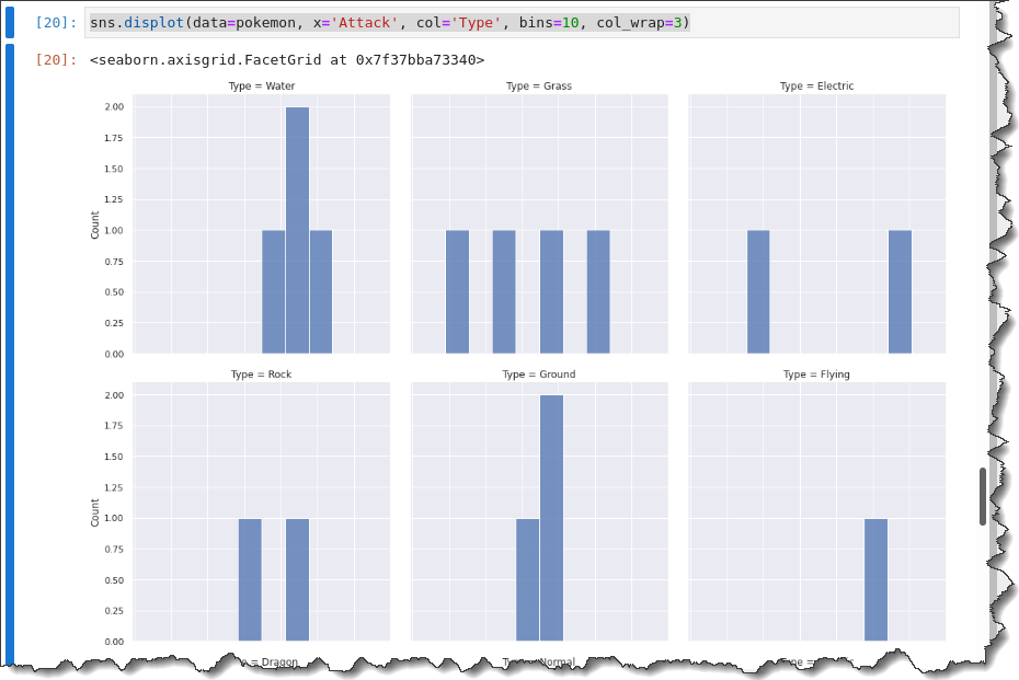
To break down each attack distribution by Type, call the displot() function with the col keyword below to create a multi-grid plot showing each Type.
sns.displot(data=pokemon, x='Attack', col='Type', bins=10, col_wrap=3)You will get the following output.
Generating Categorical Plots
Making separate histograms based on the type category is nice. But, histograms may not paint a clear picture for you. So let’s use some of Seaborn’s categorical plots to help you dive further into analyzing the attacks data based on Pokemon types.
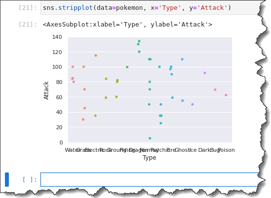
Strip Plotting
In the previous scatter plots and histograms, you tried to visualize the Attack data according to a categorical variable (Type). This time, you will make a strip plot, a series of scatter plots grouped by category.
To create your categorical strip plot, call the sns.stripplot() function and pass in three arguments: data=pokemon, x='Type', and y='Attack'. Run the code below in Jupyter to generate the categorical strip plot.
sns.stripplot(data=pokemon, x='Type', y='Attack')Now you have a strip plot with all observations grouped by Type. But notice how the x-axis labels are all smushed together? Not so helpful, right?
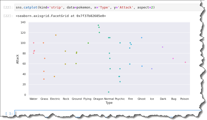
To fix the x-axis labels, you’ll have to use a different function called catplot().
On your Jupyter notebook command cell, run the sns.catplot() function and pass in five argumentskind='strip', data=pokemon, x='Type', y='Attack', andaspect=2, as shown below.
sns.catplot(kind='strip', data=pokemon, x='Type', y='Attack', aspect=2)This time, the resulting pot shows the x-axis labels in full width, making your analysis more convenient.
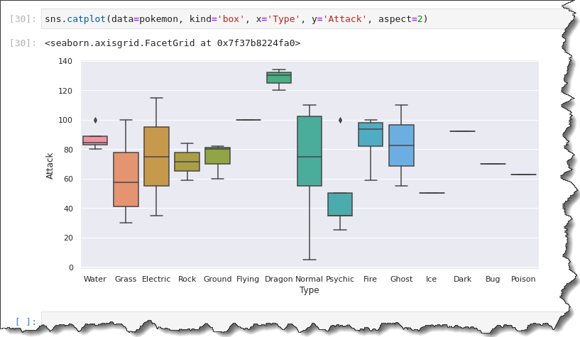
Box Plotting
The catplot() function has another subfamily of plots that will help you visualize data distribution with a categorical variable. One of them is the box plot.
To create a box plot, run the sns.catplot() function with the following arguments: data=pokemon, kind='box', x='Type', y='Attack', and aspect=2.
The aspect argument controls the spacing between the x-axis labels. A higher value means a wider spread.
sns.catplot(data=pokemon, kind='box', x='Type', y='Attack', aspect=2)This output gives you a summary of the spread of data. Using the catplot() function, you can get data spread for each Pokemon Type on one plot.
Notice that the black diamond markers represent outliers. Instead of a box plot, a line in the middle means that there’s only one observation for that Type of Pokemon.
You have a five-number summary for each of these box and whisker plots. The line in the middle of the box represents the median value or their central tendency of Attack points.
You also have the first and third quartiles and the whiskers, representing the max and minimum values.
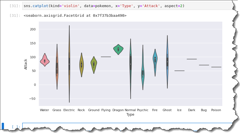
Violin Plotting
Another way of visualizing the distribution is by using the violin plot. The violin plot is like a box plot and a KDE mix. Violin plots are analogous to box plots.
To create a violin plot, replace the kind value to violin, while the rest are the same as when you ran the box plotting command. Run the code below to create a violin plot.
sns.catplot(kind='violin', data=pokemon, x='Type', y='Attack', aspect=2)As a result, you can see that the violin plot includes the median, the first, and the third quartiles. The violin plot provides a similar summary of the data spread to the box plot.
Revisiting the question: What is Attack distribution for each type of Pokemon?
The box plot shows the minimum Attack points lie between 0 and 10, while the maximum goes up to 110.
The median Attack points for Normal Type Pokemon look to be about 75. The first and third quartiles look to be around 55 and 105.
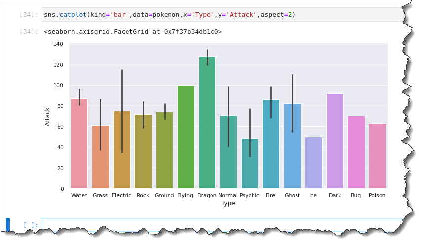
Bar Plotting
The bar plot is a member of Seaborn’s categorical estimation family that shows each data category’s mean or average values.
To create a bar plot, run the sns.catplot() function in Jupyter and specify six arguments: kind='bar', data=pokemon, x='Type', y='Attack', and aspect=2, as shown below.
sns.catplot(kind='bar',data=pokemon,x='Type',y='Attack',aspect=2)The black lines on each bar are error bars representing uncertainty, like outliers in the observations. As you can see below, the mean values are:
- About 90 for the Water-type Pokemon.
- Around 60 for Grass.
- Electric is approximately at 75.
- Rock maybe 70.
- The Ground within 75.
- And so on.
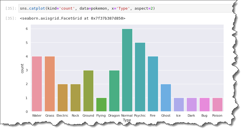
Count Plotting
What if you want to plot the count of the Pokemon instead of the mean/average data? The count plot will let you do that with the Seaborn Python library.
To generate a count plot, replace the kind value with count, as shown in the code below. Unlike the bar plot, the count plot only needs one data axis. Depending on the plot orientation you want to create, specify either the x-axis or y-axis only.
The command below creates the count plot showing the type variable on the x-axis.
sns.catplot(kind='count', data=pokemon, x='Type', aspect=2)You will have a count plot that looks like the one below. As you can see, the most common types of Pokemon are:
- Normal (6).
- Psychic (5).
- Water (4).
- Grass (4).
- And so on.
Conclusion
In this tutorial, you’ve learned how to create statistical plots programmatically with the Seaborn Python library. Which plotting method do you think will be most appropriate for your dataset?
Now that you’ve worked through examples and practiced creating plots with Seaborn, why not start working on new plots on your own. Perhaps you can begin with the Iris dataset or gather your sample data?
And while you’re at it, try out some of the other Seaborn built-in templates and color palettes, too! Thank you for reading, and have fun!