You can build Azure resources all day, but you’re in rough shape if you don’t remember how they all fit together. Visual diagrams are a great way to map out how your cloud infrastructure fits together to understand it at an architectural level. An Azure diagram is no different.
Whether it’s an Azure diagram or something from other cloud providers like Amazon Web Services and Google Cloud Platform, understanding and building cloud diagrams is an important skill.
In this article, you will learn some generic best practices for building cloud diagrams while drilling down into Azure-specific examples a little later.
Translate Business to Technical Requirements
In an ideal world, business and technical requirements are synchronized perfectly. In reality, that concept couldn’t be farther from the truth. A cloud topology diagram can make the connection between the two if you do it well.
User stories are a great way to map business to technical requirements.
Suppose your organization has a workflow defined to handle customer service tickets coming in Zendesk. Each time a customer creates a ticket, that information gets sent to Amazon Web Services using a serverless architecture to detect customer sentiment.
This process involves a few different teams, mainly customer service, data science, and business intelligence. You’re in charge of coming up with a functional diagram that covers each step in the ticket workflow built in a way that considers each team’s responsibilities.
The customer service team will only need a flowchart of how to handle the Zendesk tickets. What happens in AWS is not relevant to them. On the other hand, the data science and business intelligence teams will be concerned about how the data consumption and processes (such as the data transformations) are necessary.
To accommodate each team, you should create three diagrams representing only the tasks that each particular team cares about.
For example, you could create a diagram for customer service that looks similar to the below flowchart.
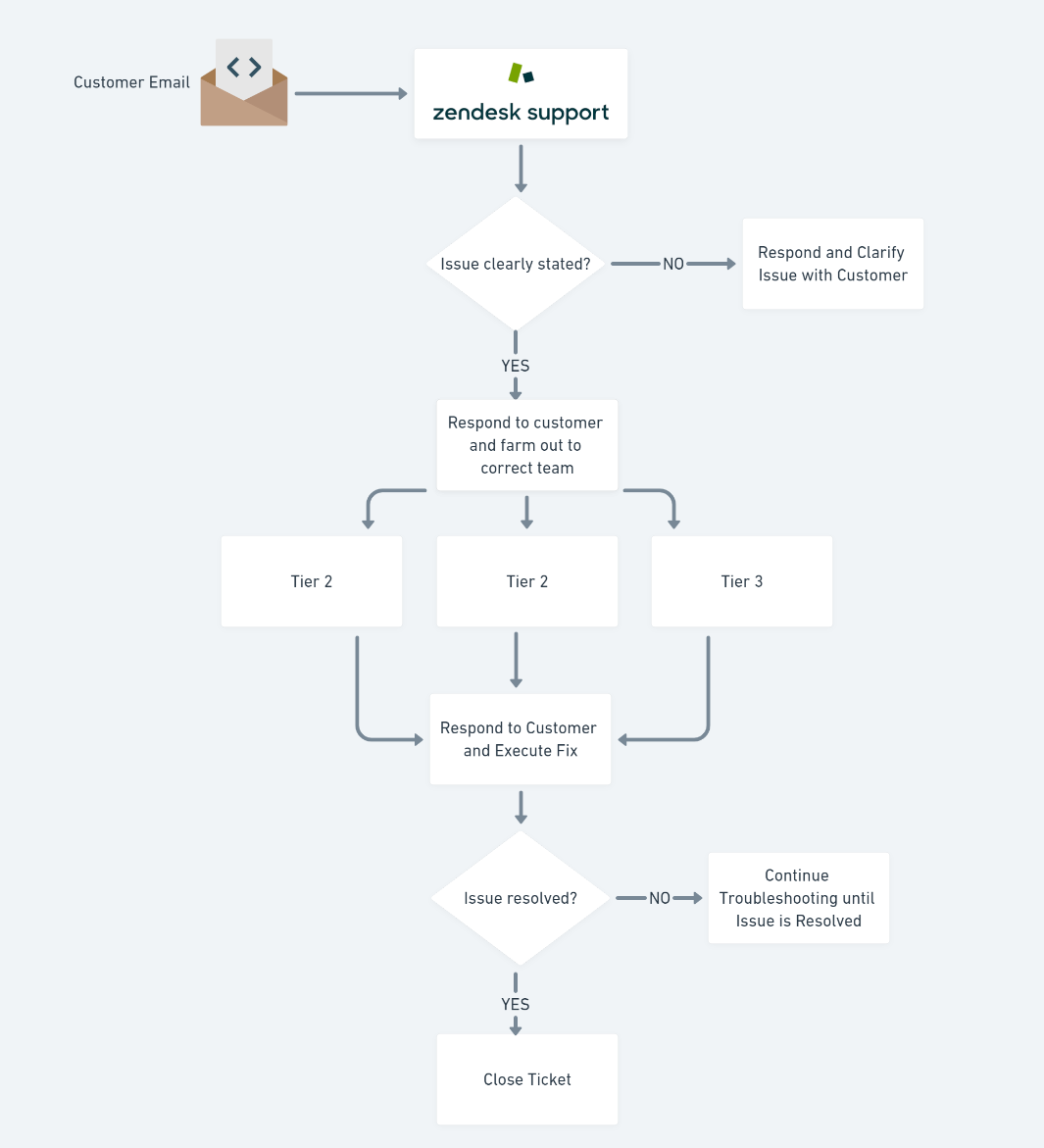
The same process can initiate from Zendesk support for the data science team, but this time takes a different path into AWS and maps out each technical step required to process each ticket.

If you employ a solutions architect, they may want to get a broader representation of each step in the process. The flowchart below extends to machine learning for analysis.
Since the flowchart for the data engineer and solutions architect are so similar, you could also combine them and perhaps define layers you can hide and expose where necessary.

At this stage, you’re not done. You are just getting a feel for each team’s elements and the level of detail required.
Picking a Standard
When it comes to diagrams and mapping out data, you have many different options to choose from. You could create your own ad-hoc way of mapping processes, or you could use one of many different pre-established standards. UML, for example, is a standard with strictly defined parameters.
Don’t reinvent the wheel. You can find many different Azure diagram templates, for example, in the Azure solutions architecture gallery. If you are into the Internet of Things, take a look at this Azure implementation of IoT cloud diagram.
When it comes to the cloud, each major cloud vendor has a particular architecture standard they encourage.
Choosing a Design
Once you come up with a standard architecture, you should then decide on a design. Designing the elements of a cloud diagram such as picking a color scheme, icons and connectors may seem frivolous to an engineer. But, for other more non-technical teams, visual design is key to understanding the diagram better.
You don’t need to be a Picasso but using Gestalt’s principle on design and visualization, remember to:
- Use color to group things together visually or make certain elements pop out for emphasis.
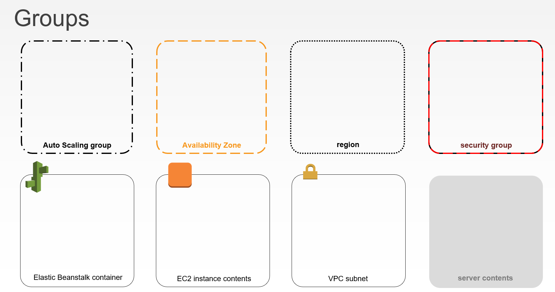
- Add a special colored border for specific areas that you want to highlight.
- Group elements or connect them to be perceived as part of the same group.
Color Schemes (Branding)
If you’re in an organization that has a branding guide, use it. Large organizations like Instagram have their branding guidelines like this published on their site so that people know how to use their assets properly. If this diagram is used across teams, stay on brand with the colors.
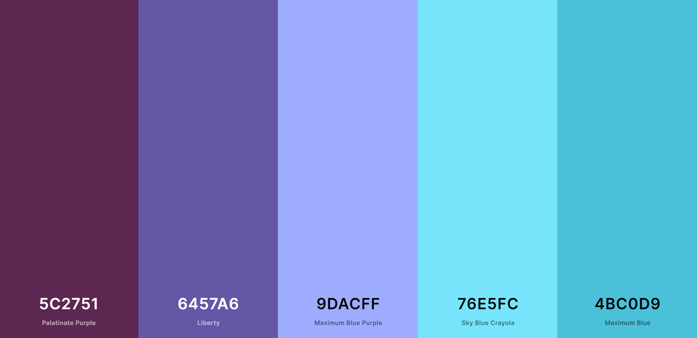
If you are not restricted by a branding guide, you can use something like Coolors palette generator to make sure the colors you are using are compatible with each other.
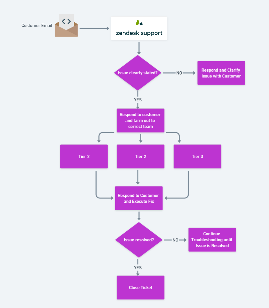
Below you can see what the previous diagram may look like with a color scheme applied.
In the image below, the colors of the bounding boxes for AWS indicate which elements involve internal resources from the diagram and which parts are open to the public or departments outside the tech team.
Icons
Icons, for example, are a great way to convey information in a diagram and make the diagram aesthetically pleasing.
Different cloud vendors provide their own preferred icons.
Google Cloud Platform even has a handy guide to help you translate icons between its cloud and its competitors.
Choosing the Tool
Once you’ve settled on your cloud diagram requirements, it’s time to go looking for a tool that can accommodate them. And you have a lot to choose from. To name a few:
- Draw.io
- Microsoft Visio
- Lucidchart
- Whimsical
- Google Drawing
- Omnigraffle (for Mac users)
Some tools even support dynamic elements. Figma, for example, allows you to animations when you click or hover on the diagram.
Not up for a dedicated diagram tool resource? Templates for presentation software like Microsoft Powerpoint and Google Slides help you make some basic diagramming tools. A good free example of this is Slides Carnival.
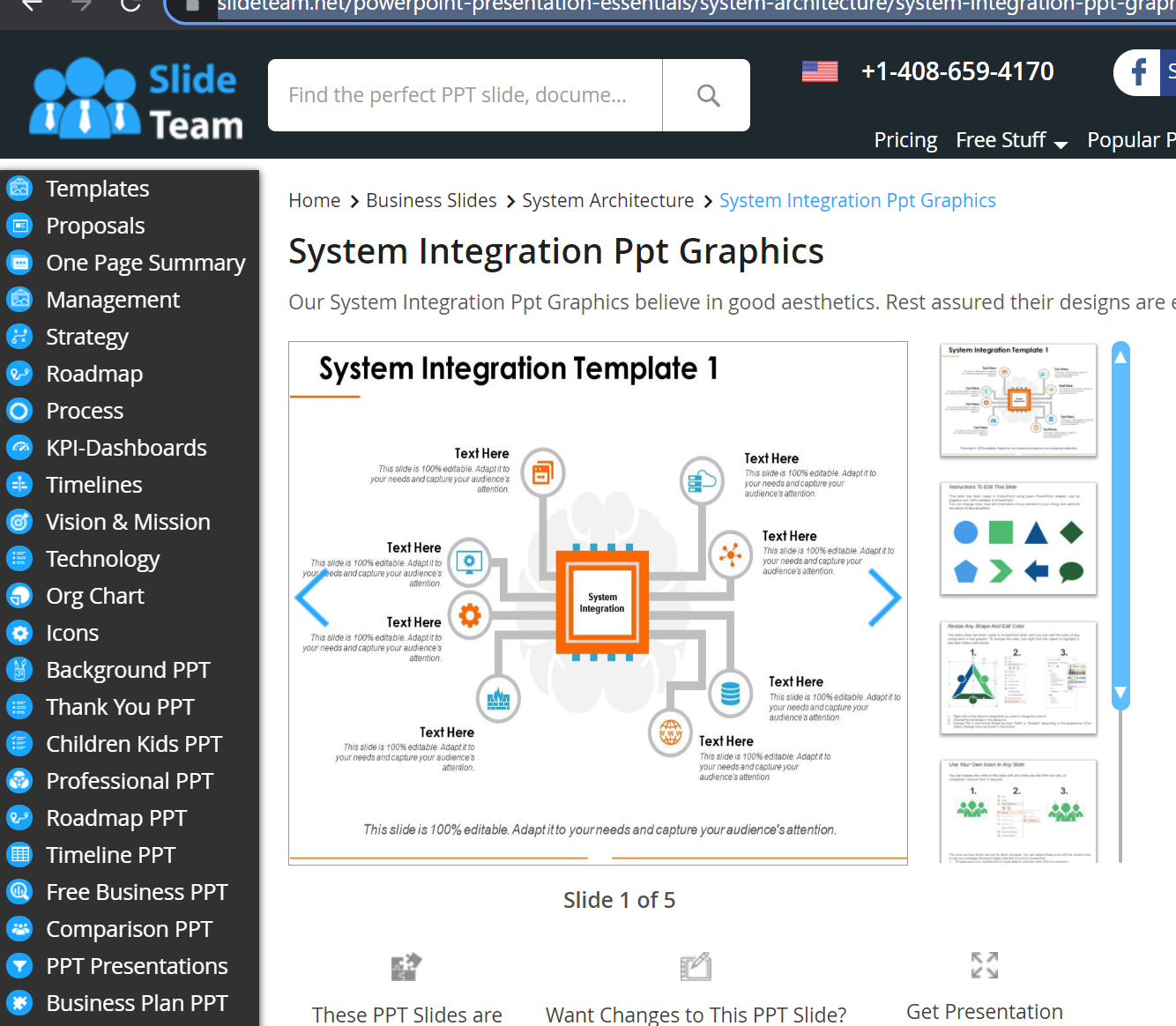
In choosing a diagram tool, make sure you factor in the learning curve in the diagram tool that you are willing to work with. A good example of this is PowerMockup or something like SlideTeam, where you just add the icons for the cloud services of choice as shown below:
Building Azure Diagram Programmatically
You’ve learned how to create cloud diagrams from scratch throughout this tutorial, but what if you didn’t have to? Maybe you already have an infrastructure built but need to visualize it via a diagram. Using various tools, you can create diagrams automatically!
For example, using a PowerShell module called AzViz, Prateek Singh creates Azure diagram from existing Azure resources.
A cloud solutions architect from Microsoft demonstrated in a Youtube video that animating the diagram is possible with something like a D3 JavaScript library for your cloud topology.
If you’re a developer, chances are if you search for your “<language of choice> cloud diagram”, chances are you’re going to find a paid or free community tool to help you create cloud diagrams from existing resources.
The ATA Cloud Diagram Checklist
If you take away anything from this article, copy and paste the below checklist somewhere to reference later. The next time you need to create an Azure diagram (or any cloud diagram), answer these questions to help you create a functional (and beautiful) cloud diagram!
- Does the diagram cater to the stakeholder wish list from the first step?
- Are all critical and supporting cloud services reflected on the chart?
- Are all data connections and layers reflected on the chart?
- Is security on the architecture demonstrated on the chart in some way?
- Does it distinguish between elements (hybrid versus on-premises resources versus cloud resources)?
- Did the diagram follow the company branding rules or at least use a good color palette?
- Did the diagram follow the standards on that particular diagram? (UML standards, cloud architecture icon standards depending on brand of cloud architecture used, etc)
- Did the diagram follow Gestalt’s basic visualization principles?
- Did you have other people’s feedback on the diagram?
Conclusion
Like anything in technology, building stunning and functional cloud diagrams is a skill that you can master over time. Build and repeat until you’ve become a diagramming ninja!
How has this article helped you create cloud diagrams?


